
Running Legacy Reports
Once you run the report, the data is used to create a graphic or tabular chart of this information. Each time that you change the appearance of a report, you can run it again to see the new results.
Before you can run a report, all of its properties and data series options must be defined by someone with appropriate rights. You can select the appearance of the report data at a later date if necessary. See Building Reports for more information.
Note: This section discusses how to request an immediate run of a report. It is also possible to schedule a report to run automatically at predetermined intervals. For details on how to schedule a report, see Scheduler.To run a report
- If necessary, click the Reports tab.
- Select one of the following options:
- In the Reports list view, in the right pane, click the report that you want to run.
- Open the Collection or Folder that contains the appropriate report, and then click the report that you want to run.
If you have already run this report recently, you might see cached output instead of new output retrieved from a full report run. To learn more about cache, see Viewing a Cached Report. See Changing the Appearance of a Report if you want to make cosmetic changes to a report. This will not change the appearance of the original report.
To run a report with parameters
Note: If there are no parameters associated with this report, it runs immediately and appears as a chart or tabular report based on its settings.If Parameters are defined (values that you enter before the report is run), the Parameters page opens. Review or change the parameter values, and then click Run Report to display the chart. See Building Reports for more information.
After a report with parameters runs, link Clear Values will erase any parameter values that had been entered previously. Link Reset to Default will erase any previous parameter values, then replace them with the default values that were defined when the report was built.
Neither of these two links will cause the report to run again. You must explicitly click the Run Report link to run the report again.
Running Drill-down Reports
____________________________________________________________________________________________________________________________________________
NOTE: TeamConnect versions 5.2.9+ and 6.2.2+ are no longer using Flash technology to render native reports so the behavior of drill-down reports has changed. If a report has additional drill-down report options, they can be selected from the menu at the top of the report. The user selects a drill-down report and "Run Report." The drill-down report will replace the existing report in the open window. The user can select the back arrow to return to the main report.___________________________________________________________________________________________________________________________________________
Some reports are designed to use drill-down reports. If the report that you are running supports drill- down reports, you can launch the drill-down report by clicking on an element of the graphical chart output, such as:
- Column
- Bar
- Pie Slice
- Line
When you click on one of these elements, the drill-down report opens, and its chart output replaces the chart output that you had been viewing. (To return to the chart you had been viewing, click the link Back to Report Execution.)
The output of the drill-down report is restricted to those records that match the element you clicked on. For example, if you had been viewing a Column chart in which each column represented an invoice type, and you clicked on the column labeled "Accrual", the drill-down report output that appears would contain only Accrual invoices.
Note: Drill-down reports are not supported on the Apple iPad in versions before TeamConnect 5.2.9 and 6.2.2.
Viewing a Cached Report
When you run a report, the output is automatically cached (stored in the computer's memory). If you navigate away from the report to do other work in TeamConnect, then return to the report, the output is retrieved from the cache without re-running the report.
Note: Reports are cached on your Home Page only.
TeamConnect continues to use the cached output unless it encounters one of the following conditions. If any of these conditions are true, the report output will be produced from a new run, not from cache:
- The Data Warehouse has been refreshed since the last time you ran the report.
- The report properties have been edited and saved (by you, or another user) since the last time you ran the report.
- The report uses the Tabular Only chart type. Output for this chart type is not cached. All other chart types are cached.
- The report has parameters, and you are executing the report from within the Parameters page. In this case, cache will not be used. (A report with parameters that is executed by simply clicking its name in the report list page will still use cache.)
- You run out of cache memory on your computer. If you cache a large number of reports and the cache uses all the memory reserved for it, the cache will remove the oldest cached report output in order to make room for new, incoming report output. The older reports will no longer be available in cache.
- The report is re-run by clicking on a report in the list view, or by clicking the Run Report button.
It is possible to change the appearance of the report output using the chart bar, as described in Changing the Appearance of a Report. But such changes do not affect the stored output in cache. Only changes to the report properties themselves would affect cache - property changes would force a new, full run of the report.
Changing the Appearance of a Report
____________________________________________________________________________________________________________________________________________
NOTE: TeamConnect versions 5.2.9+ and 6.2.2+ are no longer using Flash technology to render native reports so the interaction with the selectors to change the appearance of a report will be different. Following research on this feature, the number of options have been reduced to match those most frequently used by clients. The options now include Chart Type, Show Results and Maximum Number of Results. The revised report does not auto-generate, the user must click the "Run Report" button. The selections will appear as follows (descriptions of the options can be found below):

____________________________________________________________________________________________________________________________________________
You can edit the way your report output appears. The options that are available are based on the type of chart that you are viewing and your assigned rights.
Note: Changes in chart view are temporary and do not alter the original view of this chart. You can export changes, but to make permanent changes, you must have rights to edit chart properties.
Note: Most of the features discussed in this section are not supported on the Apple iPad, since Adobe Flash is not available on the iPad. The alternative chart output on the iPad may differ from Flash output in background color, bar colors, pie colors, column colors, area colors, line colors and y-axis value.
To change the appearance of a Report:
- View the chart that you want to change.
- In the chart bar, make the appropriate changes. See the Chart View field descriptions table for specific chart bar option information.
- The changes are immediately reflected in the chart view.

- The table below contains the available options for the different types of reports.
Chart View Field Descriptions
|
Field |
Options |
|---|---|
|
Type |
The type of chart in which you want to view the report data. Options:
For specific information about chart types, see Types of Report Formats. |
|
Sub-type |
The way the information appears graphically. The available options are based on the chart you select in the Type list as follows:
|
|
Legend |
Location of the chart legend. Options:
|
|
X-Axis |
Location and orientation of the X-Axis label. Applies to Bar, Column, Line, and Area charts only. Options:
Wrap and Stagger are not supported on the Apple iPad, since Adobe Flash is not available on the iPad. |
|
Labels |
Display or hide the values on the chart. Options:
|
|
Results |
How many results to show on the chart. Options:
|
Types of Report Formats
You can view report data as a graphic representation, such as a pie chart, or a tabular format which lets you view information as a spreadsheet. You can switch between these views at any time.
When using graphical charts, it is recommended that you match the type of data to the appropriate type of chart. For example, if you want to show trends over a period of time, it is best to use a line chart instead of a pie chart because a pie chart is designed to display information for a specific moment in time.
Graphic Charts
____________________________________________________________________________________________________________________________________________
NOTE: TeamConnect versions 5.2.9+ and 6.2.2+ are no longer using Flash technology so the appearance of graphic reports will be slightly different. Example:
Before: After:


____________________________________________________________________________________________________________________________________________
There are several types of default graphic reports as follows:
- Column
- Bar
- Pie
- Line
- Area
Once report data is open as a graphic chart, with the appropriate rights, you can make changes to the way the chart looks and export the graphic to a .pdf file. See Changing the Appearance of a Report for more information.
-
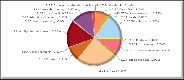
Pie Chart—Displays information in a circular format with specific data represented as slices of the overall pie. Best used to display information for a specific point in time.
Tip: When working with pie charts, single click on a slice of the pie to separate it from the rest of the pie. Single-click again to move it back to the pie.

-
Line Chart—Display information as points connected by a line. Best used to show trends in data over a period of time.

-
Bar Chart—Displays information in horizontal bars. Best used to display a small amount of information over time and under different conditions.

-
Column chart—Displays information in vertical bars. Best used to display a small amount of information over time and under different conditions.

-
Area chart—Displays information in a filled area display. Best used for cumulative totals over time.

Tabular Chart
Tabular chart data is displayed in a spreadsheet format. You can sort the information in ascending or descending order by clicking the column header. (Data which spans columns does not have a column header, thus cannot be used for sorting.) You can export tabular data to Excel or to a .pdf format.
To access a Tabular chart
If a chart is defined as a Tabular only, it will open in Tabular View by default.

If you are in chart view, click the View Results link to present the chart in a tabular spreadsheet format. This link is in the upper right corner of the screen.
Exporting Reports
You can export a graphic to a .pfd format, and a tabular chart to both Excel and a .pdf format.
Note: To export to the .pdf format, you need at least Acrobat Reader version 9.4.0.
To export Reports
Run the report that you want to export. See Running Reports for more information.
-
For a Graphic chart—Click Export Chart. The chart is saved and opened as a .pdf.
-
For a Tabular chart—Click the Export Results drop-down list, and then select Export as Excel or Export as PDF. The data is saved or opened based on the action you select.