
Designer User Interface
This is the Designer User Interface! It's easy to navigate between the Form Builder and the Workflow Builder, and between the Designer and anywhere else in TAP. Multiple form fields can be selected at once using the handy “shift+click” function.
.jpg?revision=1)
Left Side Menu
- Save
 - Click this icon after making the necessary changes in the workflow.
 - Preview
 - Click this icon to preview the workflow once changes are made and workflow is saved.
 - Publish
 - If the workflow is already published, this is not highlighted. If the green tick is enabled, then the workflow is ready to be published.
 - Set Workflow Permissions
 - Click this icon to set the necessary workflow permissions.
 - Legacy UI
 - Click this to change the User Interface to an older version. Click the
  icon on the top right corner of the page to return to the current UI.
Form Field Elements
Workflow forms are created through the Properties page using a set of 30 fully customizable form fields. Form fields can be easily added to and repositioned in the Properties page. Form fields can further be customized by selectively applying preferences specific to each form field.
Know the complete details of All Designer Form Field elements.
Workflow Properties and Options
Workflows are created in the Workflow (Pane | Page) of the Designer. Here you can add stages and relationships as well as a variety of properties and settings to each that allow you to create custom & unique workflows for your individual company needs.
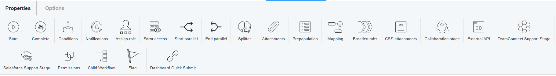
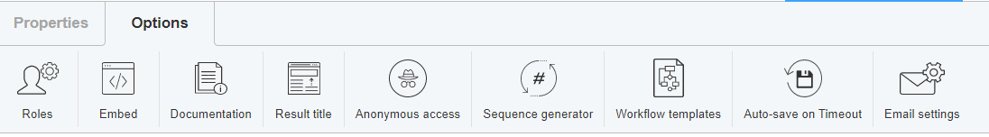
Know complete details about Workflow Properties and Options
Right Hand Menu
The right-hand menu shows all the properties associated with each form element selected. The options can be customized for every form element.
The access and modification to each field are given against the field in All Designer Form Field elements page.
Additional Settings
All the above form fields can be modified using a few Additional Settings.
The common settings for all the fields are: 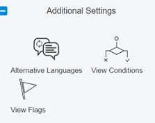
1. Alternative Languages – The languages used in the form can be changed using this option.
2. View Conditions – Conditions for the selected form field can be either set/ viewed using this option.
3. View Flags – Flags, if present for the selected form field can be viewed using this option.
Along with these, every field has its own customization option.
UI changes
The look and feel of the page can be adjusted by changing the Styles. 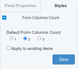
The fields added can be viewed in 1, 2, or 3 columns.
If Apply to existing items is selected, all the fields already present will also be adjusted in the preferred columns.
To know more about the form fields, blocks, and other details to design a form, click here.