
All Designer Form Fields
Workflow forms are created through the Properties page using a set of 30 fully customizable form fields. Form fields can be easily added to and repositioned in the Properties page. Form fields can further be customized by selectively applying preferences specific to each form field.
Accessing the Properties Page
To access the Forms - Properties Page:
- Click the Business Automation
.jpg?revision=1) button in the TAP Toolbar to access the Business Automation module.
button in the TAP Toolbar to access the Business Automation module.
- The Designer tab is selected by default, and the screen displays the Designer Homepage.
- Click the Create button.
- The Designer displays the Forms - Properties page.
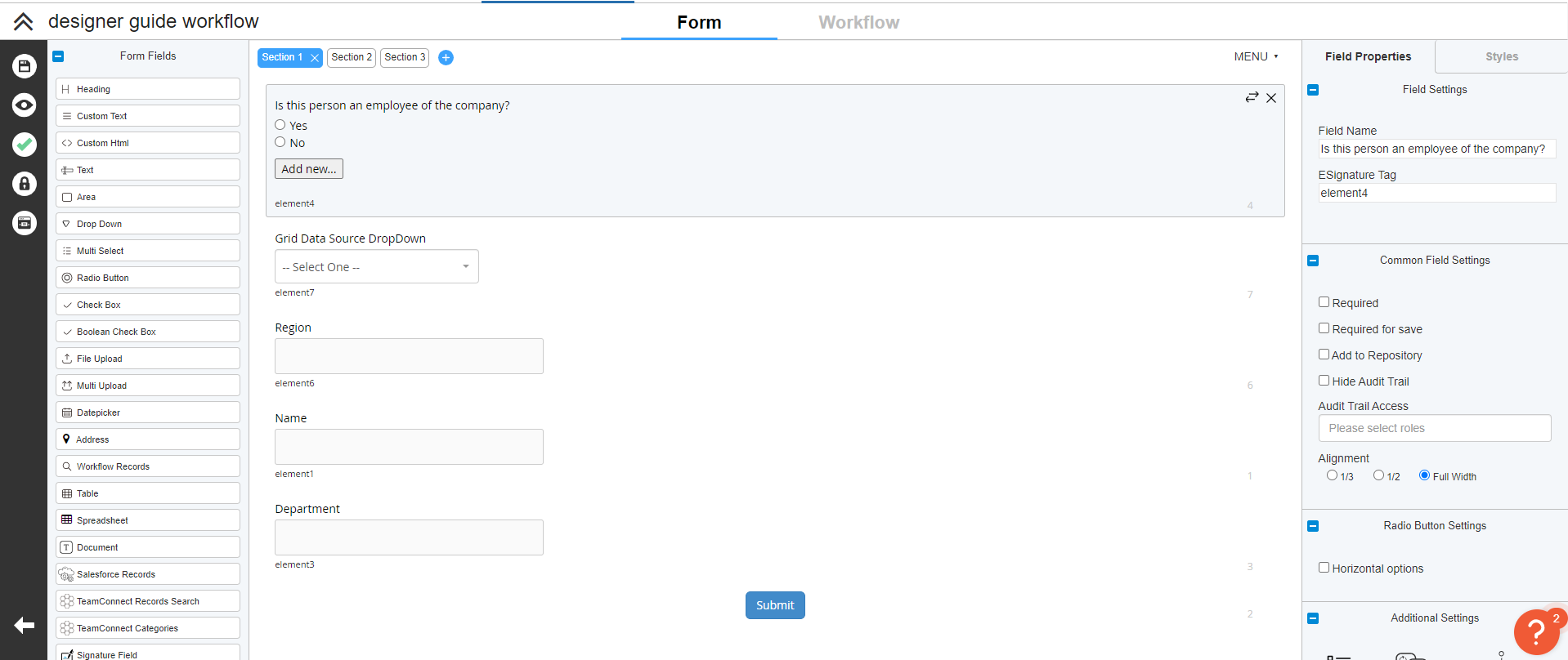
The Properties Page
The Properties Page contains the following functional areas:
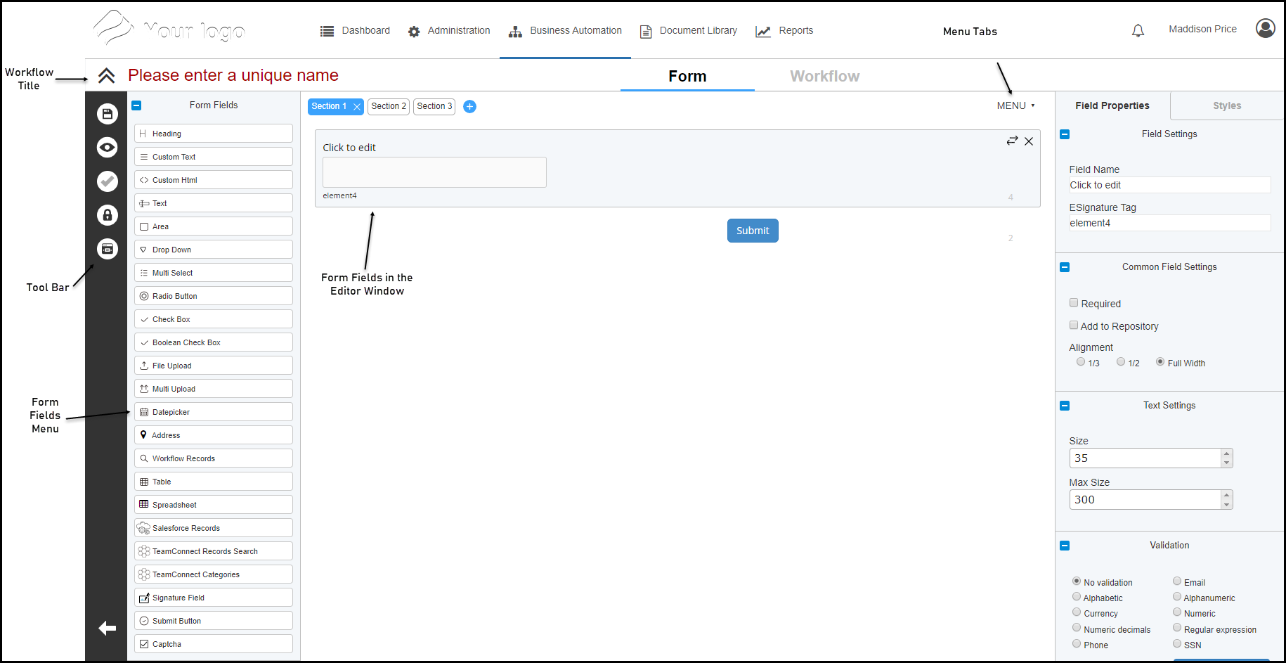
- Workflow Title - This lets you assign a name to the workflow form
- Tool Bar - Provides the tools for specifying form options and form field properties
- Form Fields Menu - Drag a field to the Editor Window to add the field to the workflow form
- Editor Window - Provides the work area for creating a workflow form
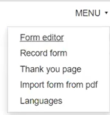
- Menu Tabs - Toggles between the Form editor, Record Form, Thank you page, Import form from PDF, and Languages.
Creating a Form
Workflow forms are created by arranging a selection of form fields to reflect the data, approvals and signatures required by a given business process. A workflow form can be created as a single, continuous form, or it can be divided into two or more logical sections. Form fields can be added to the form manually by dragging and dropping from the Form Fields Menu, or the form can be populated using form field data contained in a tagged PDF file. Additionally, form fields have a unique set of properties that let you configure the appearance and/or functionality of the field.
To create a workflow form:

Click the Save button while working to save your progress and continue editing.
- Access the Properties Page.
- Enter a name for the form in the Title Bar.
- Set the desired form options for font face, size and style for labels and fields in the form.
- For multi-section forms, define the appropriate sections.
- Add the appropriate form fields to the form.
- To add a field to the form from the Form Fields Menu, click and drag the desired field from menu to the Editor Window.
- To populate the form from a tagged PDF file, click and drag the PDF file from your workstation to the Editor Window.
- To copy and paste one or more form fields:
- To copy a single field, click the form field you wish to copy; the selected field is highlighted.
- To copy multiple fields, press and hold the Ctrl key, then click each field you wish to copy; the selected fields are highlighted. When all desired fields have been selected, release the Ctrl key.
- Press Ctrl+C to copy the selected form fields; The message "Selected form items were copied" displays.
- Press Ctrl+V to paste the copied form fields; the copied fields are added to the bottom of the form.
- To switch between sections (for multi-section forms) click the name of the desired section at the top of the Editor Window.
- Edit the form field labels.
- Double-click a form field label, select the existing text, and enter a new label as appropriate.
- Apply properties to form fields as appropriate.
- To reposition a form field, click and drag the field to the desired location.
- When the form is completed, click the Save button to save the workflow form.
- To create a workflow for the form, click the Workflow link in the Title Bar.
- To return to the Designer Homepage, click the Business Automation and then Designer.
Form Field Controls
The tab in the upper right corner of each form field provides three buttons that support the following functions:
 Change Section – Displays the Change Section dialog that lets you move the field to another section of the form.
 Delete – Removes the field from the form.
Understanding Form Fields
The Form Fields menu on the properties page includes 20 Form Fields, four pre-configured form field Blocks and six E-Signature fields that can be selectively inserted into any form. Unless otherwise specified, all fields are repeatable. The purpose and function of each field is described below.
Form Fields
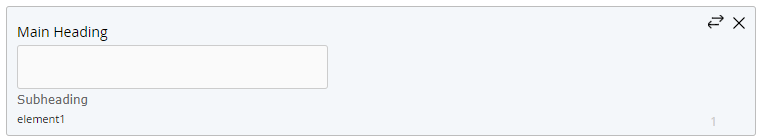
 Heading
Use the Heading field to insert a heading in the form. The Heading field is generally used to divide the form into sections and subsections. You can optionally include a sub heading.

 Custom Text
Use the Custom text field to insert a “read only” text field in the form. The Custom text field is generally used to enter descriptive or instructional text to aid the user in competing the form.

 Custom html
Use the Custom html field to insert am HTML-formatted “read only” text field in the form. The Custom html field is generally used to enter descriptive or instructional text to aid the user in competing the form.
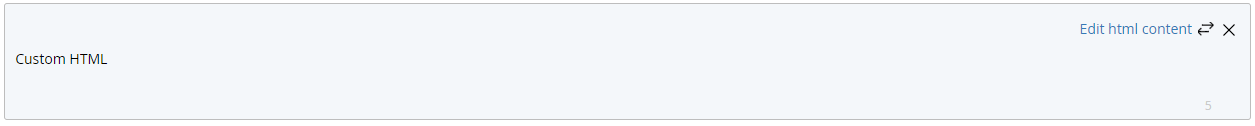
The Custom html HTML editor uses the Open Source CKEditor HTML editor to create the expiration notification content. Click here to find information on using the features and functions available through the CKEditor.
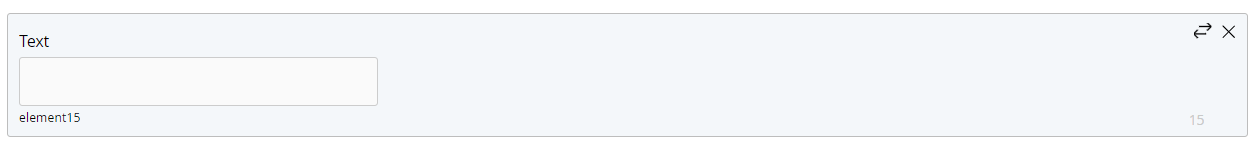
 Text
Text
Use the Text field to insert a single-line text field in the form. The Text field is generally used to support entry of a single, specific value (such as a name, address or phone number).
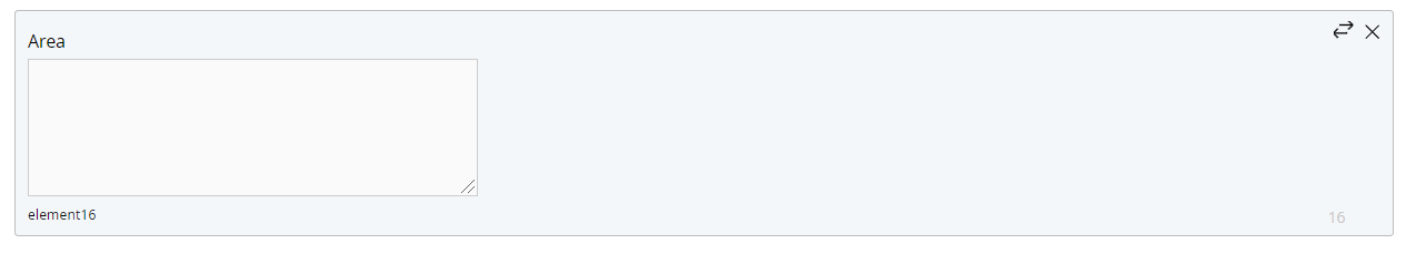
 Area
Area
Use the Area field to insert a text box in the form. The Area field is generally used to support entry of free text.
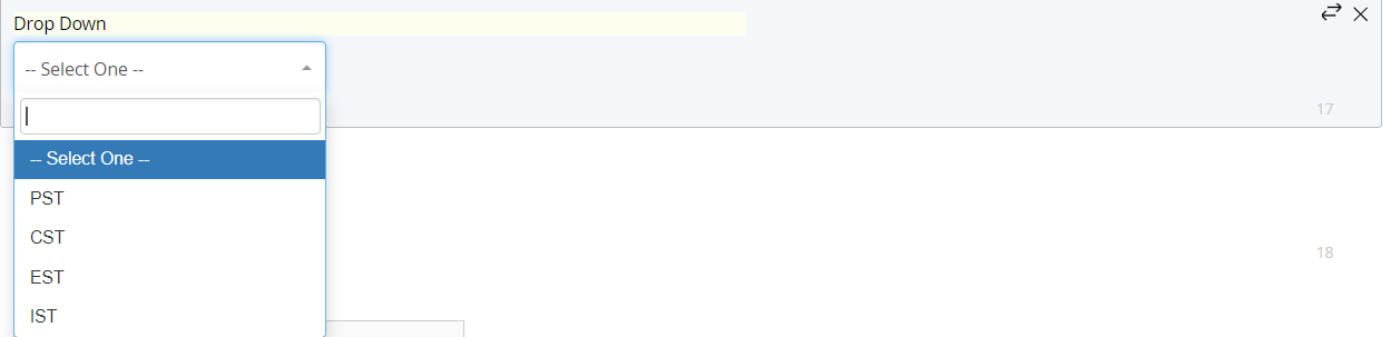
 Drop Down
Use the Drop Down field to insert a drop-down menu in the form. The Drop Down field is used to support selection of a single option from a pre-defined list of values.
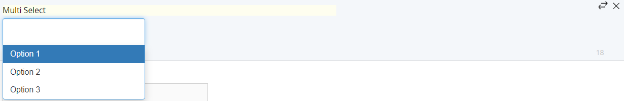
 Multi select
Use the Multi select field to insert a drop-down menu in the form. The Multi select field is used to support selection of one or more options from a pre-defined list of values.
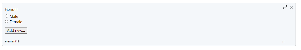
 Radio Button
Use the Radio Button field to insert two or more radio buttons in the form. The Radio Button field is used to support selection of a single option from a pre-defined set of values.
All radio buttons included in any given Radio Button field are mutually exclusive (only one radio button may be selected by the user).
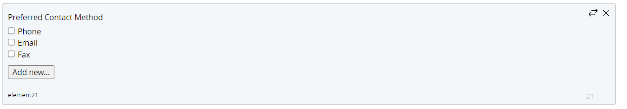
 Check Box
Use the Check Box field to insert one or more check boxes in the form. The Check Box field is used to support selection of one or more options from a pre-defined set of values.
 Boolean Check Box
Use the Boolean Check Box field to insert a single check box.

 File Upload
Use the File Upload field to insert a file upload dialog in the form. The File Upload field is used to support upload of a single file. For more information see File Upload and Multi Upload File Fields
 Multi Upload
The Multi upload field is used to support upload of a multiple files. For more information see File Upload and Multi Upload File Fields
Types of Attachments
See acceptable attachment types here
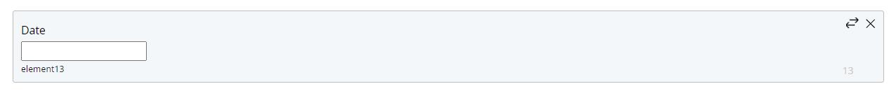
 Datepicker
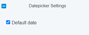
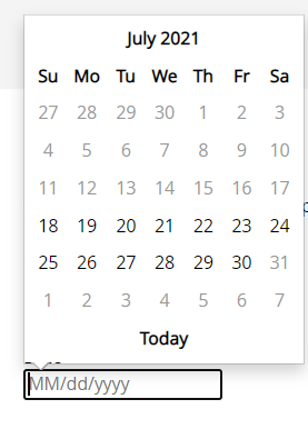
Use the Datepicker field to insert a date field in the form. The Datepicker field includes a calendar function to support selection of the desired date, and can be pre-filled with the current calendar date if desired.
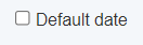
To set the newly created field to the current date, select the checkbox Default Date under the Datepicker Settings. The field is automatically set to today's date
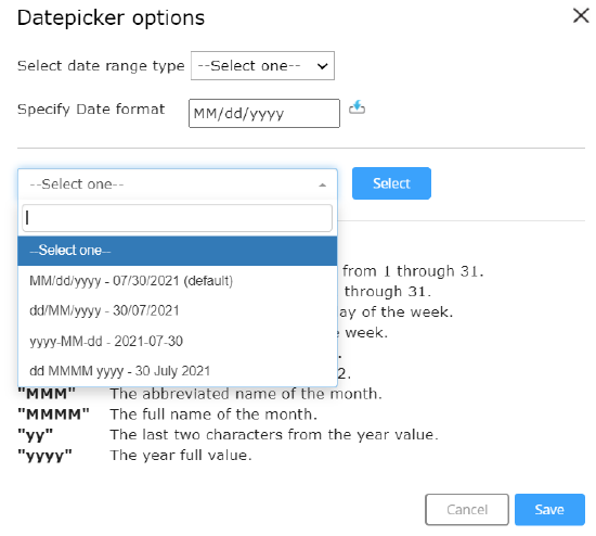
Click on Options to be able to configure- Range of Dates and Date format
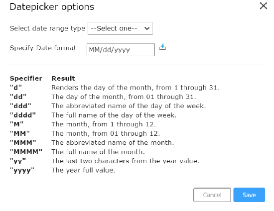
Date Format can be configured by clicking on the  icon. Date can be formatted in 4 ways and the default option(if nothing is configured) is MM/dd/yyyy.
Range of dates configuration allows user to select dates only from the specified range. It can be accomplished in two ways ,Range of Date and Range of Days. Range of dates allows user to select dates only between the two dates entered(inclusive of entered dates)
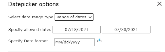
Range of Days allows user to select dates for the range of number of days(with respect to the current date) entered. It's necessary to enter either
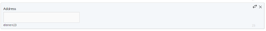
 Address
Use the Address field to insert an "auto-complete" type address field. The Address field type uses Google’s address API to auto-complete addresses in any country throughout the world. As an address is entered, the system displays a list of addresses that match the character string. The desired address can be selected from the list at any time.
The Address field is not applicable to Record Forms.
 Workflow Records
Use the Workflow records field to insert a drop-down menu containing values taken from a selected field in one or more specified previous workflows.
The Workflow records field is not applicable to Record Forms.
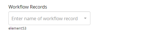
The Workflow Records field can be used to populate information from one workflow into another. When configuring a pre-population rule on a given stage, users can select a Workflow Records field and create mapping rules. Only fields that have been added to the repository will be available when configuring mapping using the Workflow Records field. Additionally, fields will be displayed using their eSign tag when selecting a parent field for a mapping rule.
Records can also be linked using the Workflow Records field. After selecting the 'Filter's option on the field options tab, check 'Link Records'. When checked, the workflow record that is identified in this field when running a new record will be linked to the record you are creating. If you check 'Link child docs to parent record', documents from the child/linked workflow will be attached to the record identified in the Workflow Records field.
A corresponding dashboard action labeled 'Show Linked Workflows' will automatically filter the dashboard for any records which have been linked to the selected record, either through parent/child relationship or through a Workflow Records field.
 Table
Table
Use the Table field to insert a table in the form. The Table field lets you include tabular data in the form.
Information can be added into and taken out of a table field using form mapping. Tables can also be prepopulated through the use of workflow records prepopulation.
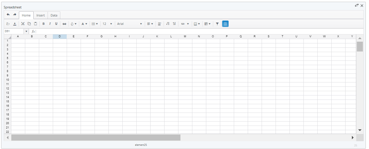
 Spreadsheet
Use the Spreadsheet field to insert a spreadsheet in the form. The spreadsheet field functions similarly to a Microsoft Excel spreadsheet, supporting Excel-like formulas, custom formatting, the ability to add/remove rows and columns, data validation, custom drop-downs, etc.
Spreadsheet fields are not applicable to Record Forms.
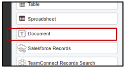
 Document Field
This form field is functionally similar to the document builder but can be added to a form and edited throughout the course of a workflow. The document form field can be used to generate documents that can be attached to notifications, added to a record’s audit log, and used in the eSignature process. By editing a document while the workflow is in progress redlining can take place before a document is generated for signature.
Go Here to read more about the features of the document form field
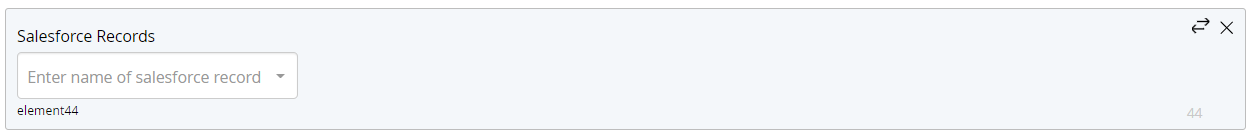
 Salesforce Records
Use the Salesforce records field to insert a drop-down menu of Salesforce Record Options in the form. The Salesforce records field is used to support selection of a single option from a pre-defined list of values.
 Submit Button
Use the Submit Button field to insert a Submit button in the form. The Submit Button field supports submission of the completed form (or section) and initiates the next stage of the workflow. Save, Reset and/or Print buttons can be optionally included in the Submit Button field if desired.
Every form must include a Submit button. A Submit Button field is added to the form the first time you add any field to a blank form.
The Submit Button field is not applicable to Record Forms.

The Generate Draft URL checkbox will generate a notification for the user once the workflow is saved. You can customize this notification by clicking the Draft Notifications icon that appears in the Additional Settings section once that box has been checked.
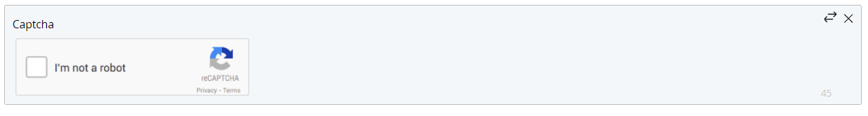
 Captcha
Use the Captcha field to insert a CAPTCHA field in the form. The CAPTCHA field is intended for use as a security measure in anonymous, public-facing forms to aid in preventing automated submissions of forms by "bots" or other computer programs.
The Captcha field is not applicable to Record Forms.
 Scan Barcode Field
This field can scan both 1 and 2 dimensional bar codes and will copy the associated value into the scan field text section. This field is only compatible with devices which have access to a camera and is not compatible with Internet Explorer.
Button Field

This field can be added to a form and when configured, can trigger a specific action or series of actions. Buttons can be used to trigger the following stage level actions: Notifications, Child Workflows, Form Mapping, External API, Salesforce Integration, Teamconnect Integrations. To do so, simply select the desired button field as the trigger field when configuring those actions on a stage. Button fields can be configured to limit the amount of presses, and can also have custom error messages set for when an action fails.
The color, icon, and label on a button field can be updated using the field options. When used on a form, a number will appear next to the button each time it is triggered. This number indicates how many times the button has been triggered in a given session, and will appear green when the corresponding action was successfully triggered, and red when it was not:

Triggering a button saves the form, and information about each trigger is added to the workflow's audit trail.
Blocks
Block fields are not applicable to Record Forms.
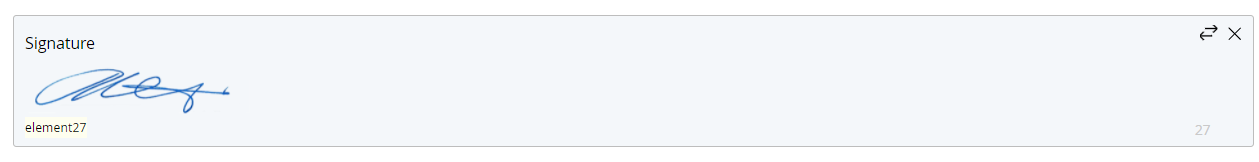
 Signature Field
Use the Signature field to insert a signature field in the form. The Signature field lets users "draw" a signature into a field on the form. The Signature field can be populated onto a document, or stored in the TAP audit trail the same as any other form field.
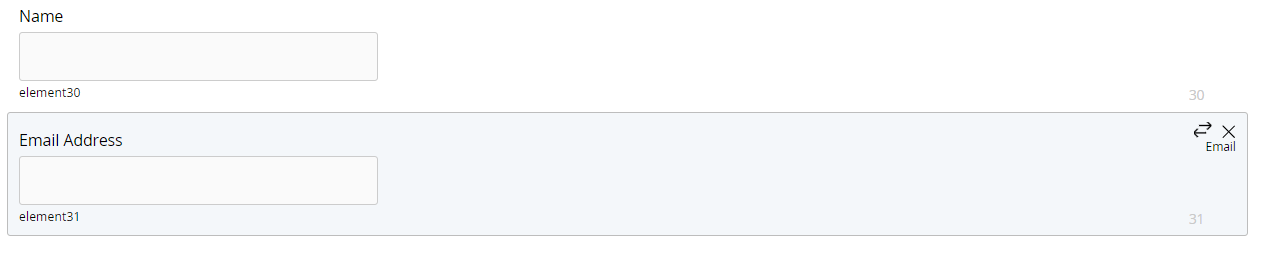
 Signature Block
Use the Signature block field to insert a pre-formatted signature block in the form. The Signature block field is comprised of two Text fields,with field labels for Name and Email Address.
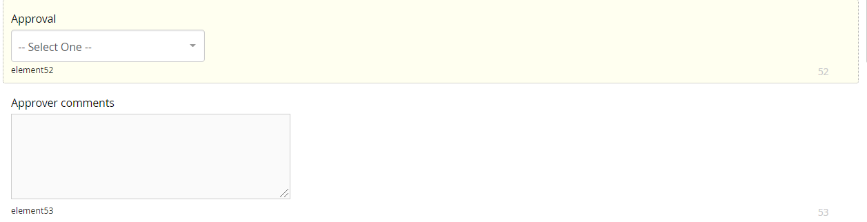
 Approval Block
Use the Approval block field to insert a pre-formatted approval block in the form. The Approval block field is comprised of a Drop Down field and an Area field, with field labels for Approval and Approver comments. The Approval menu is pre-configured with the options Approve, Deny and Request More Information.
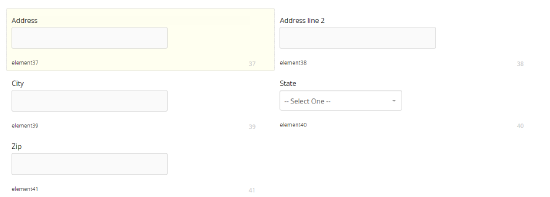
 Address Block
Use the Address block field to insert a pre-formatted address block in the form. The Address block field is comprised of four Text fields and a Drop Down field , with field labels for Address, Address line 2, City, State and Zipcode. The State menu is pre-configured with the two-letter postal code abbreviations for the 50 states.
E-Signature Functionality
E-signature fields are not applicable to Record Forms.
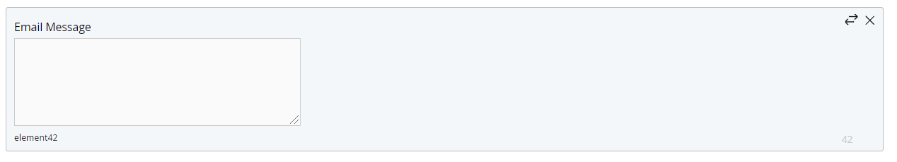
 Email Message
Use the Email Message field to allow the user to enter a personalized message which will appear in the Echosign message field..
 Localization
Use the Localization field to to allow the user to select a desired language for specific language notifications.

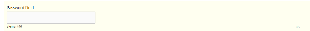
 Password
Use the Password Field to allow the user to set a password for the document.
 Expiration
Use the Expiration field to set the Echosign document expiration date.

 Reminder
Use the Reminder field to set a daily or weekly Echosign reminder message for the intended signer that a workflow stage requiring an e-signature is pending.

 Rejection Reason
Use the Reject Reason field to allow an intended signer to provide a reason for not signing a document, and submit a workflow stage requiring an e-signature without providing the signature.

Form Field Properties
All form fields (with the exception of the Custom text field) have a unique set of properties that let you configure the appearance and/or functionality of the field. Field properties can be set using the Preferences dialog (accessed from the Form Field Controls tab) and/or by highlighting the desired field and selecting the desired option from the Properties Page toolbar.
When you highlight a form field, the Properties Page toolbar dynamically updates to display only those properties applicable to the selected field.
To set properties using the Preferences dialog:
- Click the
.jpg?revision=1) button for the desired form field to display the Preferences dialog.
button for the desired form field to display the Preferences dialog. - Configure the form field properties as desired, then click the Close button to close the Preferences dialog and return to the Designer screen.
To set properties using the Properties Page toolbar:
- Click the desired form field.
- The selected form field is highlighted, and the Properties Page toolbar updates to display the available properties.
- Click the button for the desired property to display the data entry field.
- Configure the option as desired.
FORM FIELD PROPERTIES
|
Toolbar |
Property |
Description |
|---|---|---|
|
|
Add Columns |
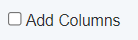
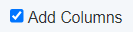
Determines whether or not users can add columns to the spreadsheet field in the workform; click the Add Columns button in the Properties Page toolbar, or select the Add Columns check box on the Preferences dialog, as desired. The default value for this parameter is "unselected" (users cannot add columns to the spreadsheet). Used with... Spreadsheet |
|
|
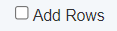
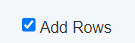
Add Rows |
Determines whether or not users can add rows to the spreadsheet field in the workform; click the Add Rows button in the Properties Page toolbar, or select the Add Rows check box on the Preferences dialog, as desired. The default value for this parameter is "unselected" (users cannot add rows to the spreadsheet). Used with... Spreadsheet |
|
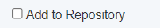
|
Add to Repository |
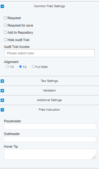
Determines whether or not a form field is added to the repository. Form fields in the repository can be edited during the workflow using the Edit option in the Workflow Dashboard Actions menu, or used with the Filters property to populate the drop-down menu in the Workflow records form field. Used with... Address Area Boolean Check Box Check Box Datepicker Document Expiration Email Message File Upload Localization Multi-select Multi upload Password Field Radio Button Reason for not Signing Reminder Salesforce records Text Workflow records |
|
|
Align block 1/2 |
Sets the width of the form field to 50% of its normal size, allowing two fields to be positioned side by side; click the Align block 1/2 button in the Properties Page toolbar, or select the Align block 1/2 check box on the Preferences dialog, as desired. The default value for this parameter is “unselected” (field is not configured for block alignment). Used with... Address Area Boolean Check Box Check Box Datepicker Document Expiration Email Message File Upload Localization Multi-select Multi upload Password Field Radio Button Reason for not Signing Reminder Salesforce records Spreadsheet Table Text Workflow records |
|
|
Align block 1/3 |
Sets the width of the form field to 33% of its normal size, allowing three fields to be positioned side by side; click the Align block 1/3 button in the Properties Page toolbar, or select the Align block 1/3 check box on the Preferences dialog, as desired. The default value for this parameter is “unselected” (field is not configured for block alignment). Used with... Address Area Boolean Check Box Check Box Datepicker Document Expiration Email Message File Upload Localization Multi-select Multi upload Password Field Radio Button Reason for not Signing Reminder Salesforce records Spreadsheet Table Text Workflow records |
|
|
Attachments access |
NOTE The Attachments access parameter can be configured only through the Properties Page toolbar. Specifies the user(s) granted access to attachments uploaded using the File Upload field. You can specify one or more authorized users. Used with... File Upload Multi upload |
.jpg?revision=1) |
Audit Trail Access | Limits Audit Trail visibility of this field to users with the roles entered. If left blank, all users with access to the Audit Trail will have visibility into the field. |
|
|
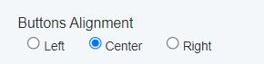
Button align |
Sets the alignment for buttons included in the field; select left, right or center. The default value for this parameter is center. Used with... Submit Button |
|
|
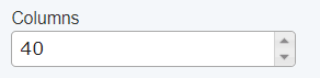
Columns |
Sets the width of the text box in number of columns; specify the text box width as desired. You can manually enter the text box width or use the Used with... Area Email Message Reason for not Signing |
|
|
Columns Width |
Sets the width of the columns in a table in pixels; specify the column width as desired. You can manually enter the column width or use the Used with... Table |
|
|
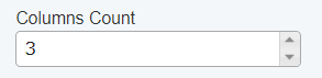
Count Columns |
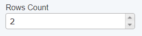
Sets the number of columns in a table; specify the number of columns as desired. You can manually enter the number of columns or use the Used with... Table |
|
|
Count Rows |
Sets the number of rows in a table; specify the number of rows as desired. You can manually enter the number of rows or use the Used with... Table |
|
|
Default Date |
Indicates whether or not the a “default” date (the current calendar date) will be automatically entered in the field; click the Default Date button in the Properties Page toolbar, or select the Default Date checkbox on the Preferences dialog, as desired. The default value for this parameter is “selected” (“default” date is automatically entered in the field). Used with... Datepicker |
|
|
Display options |
Determines whether a Custom html field is displayed as a form item or as a "popup" dialog. Click the Display options button in the Properties Page toolbar to display the Static html display options dialog. Used with... Custom html |
|
|
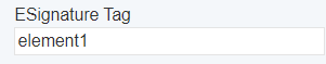
e-Signature tag |
Configures a form field with an e-signature tag; select the Required or Read only check box in the toolbar, as appropriate. There is a validation to ensure eSignature tags do not contain unsupported characters. If the eSignature tags in your workflow contain unsupported characters you will receive an error message upon saving changes to that workflow. It is important that these tags do not contain unsupported characters in order to prevent negative impacts to dashboard and other functionalities.
The e-Signature tag parameter can be configured only through the Properties Page toolbar. Used with... Address Area Boolean Check Box Check Box Datepicker Document Expiration Drop Down Email Message File Upload Localization Multi select Multi upload Password Field Radio Button Reason for not Signing Reminder Salesforce records Text Workflow records |
|
|
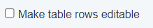
Editable |
The Editable parameter can be configured only through the Properties Page toolbar. Determines whether or not content in a Table field is editable; click the Editable button in the Properties Page toolbar, or select the Editable checkbox on the Preferences dialog, as desired. The default value for this parameter is “unselected” (content in the Table field is not editable). Used with... Table |
|
|
Filters |
The Filters parameter can be configured only through the Properties Page toolbar. Determines the set of options from which users may make selections in the Filters drop-down menu based on a specified default search field. Used with... Address Workflow records |
|
|
Formula |
The Formula parameter can be configured only through the Properties Page toolbar. Defines the content of a field based on specific logical operations performed on one or more other text fields. Used with... Document Expiration Password Field Text |
|
|
Heading size |
Specifies the size of the primary heading font in (points/pixels/??); specify the heading size as desired. You can manually enter the desired size or use the buttons to increase or decrease heading size in one-unit increments. The default value for this parameter is 20 (points/pixels/??). Sub heading font size is fixed, and cannot be changed. |
.jpg?revision=1) |
Hide Audit Trail | When this box is checked, Audit Trail visibility for values entered into this field will only be available for users with the Super Admin role. |
|
|
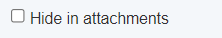
Hide in attachments |
Determines whether or not a form field is hidden in attachments; click the Hide in attachments button in the Properties Page toolbar, or select the Hide in attachments checkbox on the Preferences dialog, as desired. The default value for this parameter is “unselected” (form field is not hidden). Used with... File Upload Multi upload |
|
 (selected) (selected)
|
Horizontal options |
The Horizontal options parameter can be configured only through the Properties Page toolbar. Determines whether radio buttons (in the Radio Button field) or check boxes (in the Check Box field) are displayed vertically (in a single column) or horizontally (in one or more rows); click the Horizontal options button in the Properties Page toolbar. The default value for this parameter is “unselected” (radio buttons / check boxes are displayed vertically). Used with... Check Box Radio Button |
|
|
Hover tip |
Specifies the popup “tip text” shown when the cursor “hovers” over the field; enter the desired text. This parameter is blank by default. Used with... Address Area Boolean Check Box Check Box Datepicker Document Expiration Email Message File Upload Localization Multi select Multi upload Password Field Radio Button Reason for not Signing Reminder Salesforce records Spreadsheet Table Text Workflow records |
|
|
Label align |
Sets the alignment of the field label; select left (left-aligned at the left margin of the form) right (right-aligned at the left edge of the text box) or top (positioned above the text box) The default value for this parameter is left. Used with... Area Check Box Datepicker Document Expiration Drop Down Email Message File Upload Localization Multi select Multi upload Password Field Radio Button Reason for not Signing Reminder Salesforce records Table Text Workflow records |
|
|
Max Size |
Sets the maximum number of characters that can be entered in the text box. You can manually enter the desired number of characters or use the Used with... Address Area Document Expiration Email Message Password Field Reason for not Signing Text |
|
|
Options |
The Options parameter can be configured only through the Properties Page toolbar. Specifies the set of options from which users may make selections. You can choose to Set options manually, Use data source as option data or Use registered users as options (not available for use with Multi select field). Used with... Check Box Drop Down Multi select Radio Button |
|
|
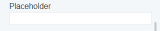
Placeholder |
Specifies the placeholder text to be shown in the “empty” field; enter the desired placeholder text. This parameter is blank by default. Placeholder text is generally used to provide instructional or advisory information, such as to indicate the content to be provided (e.g., “Last name, First name, Middle initial”) or the format of the value to be entered (e.g. “(###) ###-####”). Used with... Address Area Document Expiration Drop Down Email Message Localization Multi select Password Field Reason for not Signing Reminder Salesforce records Text Workflow records |
|
|
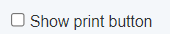
Print Button |
Adds a Print button to the field; click the Print Button in the Properties Page toolbar, or select the Print Button check box on the Preferences dialog, as desired. The default value for this parameter is “off” (Print button is not included). When the Print button is selected by a user filling out a form, the contents of the form (including all entered values) can be printed from the user’s local workstation. Used with... Submit Button |
|
|
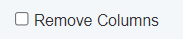
Remove Columns |
Determines whether or not users can remove columns from the spreadsheet field in the workform; click the Remove Columns button in the Properties Page toolbar, or select the Remove Columns check box on the Preferences dialog, as desired. The default value for this parameter is "unselected" (users cannot remove columns from the spreadsheet). Used with... Spreadsheet |
|
|
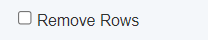
Remove Rows |
Determines whether or not users can remove rows from the spreadsheet field in the workform; click the Remove Rows button in the Properties Page toolbar, or select the Remove Rows check box on the Preferences dialog, as desired. The default value for this parameter is "unselected" (users cannot remove rows from the spreadsheet). Used with... Spreadsheet |
|
|
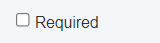
Required |
Indicates whether or not the field is a “required” field; click the Required button in the Properties Page toolbar, or select the Required check box on the Preferences dialog, as desired. The default value for this parameter is “unselected” (field is not a required field). When a field is configured as “required,” the form cannot be submitted if content has not been entered in the field. Used with... Address Area Boolean Check Box Check Box Datepicker Document Expiration Drop Down Email Message File Upload Localization Multi select Multi upload Password Field Radio Button Reason for not Signing Reminder Salesforce records Text Workflow records |
|
Required for Save | When checked, the field will be required to be filled before a user can save the form. |
|
|
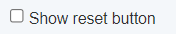
Reset Button |
Adds a Reset button to the field; click the Reset Button in the Properties Page toolbar, or select the Reset Button check box on the Preferences dialog, as desired. The default value for this parameter is “off” (Reset button is not included). When the Reset button is selected by a user filling out a form, all form fields are reset to their default values. Used with... Submit Button |
|
|
Rows |
Sets the height of the text box in number of rows; specify the text box height as desired. You can manually enter the text box height or use the Used with... Area Email Message Reason for not Signing |
|
|
Rows Height |
Sets the height of the rows in a table in pixels; specify the row height as desired. You can manually enter the row height or use the Used with... Table |
|
|
Salesforce options |
Determines the set of options from which users may make selections in the Salesforce options drop-down menu based on a specified default search field. Used with... Salesforce records |
|
|
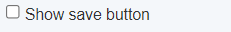
Save Button |
Adds a Save button to the field; click the Save Button in the Properties Page toolbar, or select the Save Button check box on the Preferences dialog, as desired. The default value for this parameter is “off” (Save button is not included). When the Save button is selected by a user while filling out a form, any values entered in form fields by the user are saved. Used with... Submit Button |
|
|
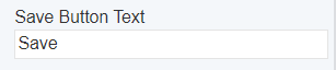
Save Text |
Specifies the label shown on the Save button; enter the desired label text. The default value for this parameter is save. Used with... Submit Button |
|
|
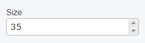
Size |
Sets the width of the text box in characters; specify the text box size as desired. You can manually enter the text box size or use the buttons to increase or decrease the text box size in one-unit increments. The default value for this parameter is 35 characters. Used with... Document Expiration Password Field Text |
|
|
Sub heading |
Inserts a sub heading below the field; enter the desired sub heading text. This parameter is blank by default. Used with... Address Area Boolean Check Box Check Box Datepicker Document Expiration Email Message File Upload Localization Multi select Multi upload Password Field Radio Button Reason for not Signing Reminder Salesforce records Spreadsheet Table Text Workflow records |
|
|
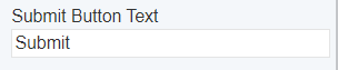
Submit Text |
Specifies the label shown on the Submit button; enter the desired label text. The default value for this parameter is submit. Used with... Submit Button |
|
|
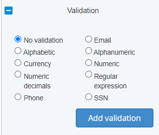
Validation |
Sets the validation criteria for contents entered in the field; select Email, Alphabetic, Alphanumeric, Numeric, Numeric decimals, Regular expression, Phone number, SSN (Social Security Number), or Currency, as desired. The default value for this parameter is “no validation.” Once selected, the validation criteria is shown in the upper left corner of the field. When Regular expression is selected as the validation criteria, use the Regular Expression Builder to select a predefined regular expression or create a custom regular expression, and define the error message shown when user input does not match the desired format.
When Currency is selected as the validation criteria, choose the Currency type, the Selection Type (Single currency or Multi-currency), and the Format against which the entered value will be validated.
Once validation has been set for a field, it cannot be removed. If you no longer wish validation to be applied to the field, you must delete the field, and then add a new field to the form. Used with... Document Expiration Text |
|
|
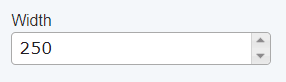
Width |
Sets the width of the drop down menu in pixels; specify the menu width as desired. You can manually enter the menu width or use the Used with... Drop Down Localization Multi select Reminder Salesforce records Workflow records |
 (unselected)
 (selected)
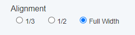


.jpg?revision=1) buttons to increase or decrease the text box width in one-column increments. The default value for this parameter is 40 columns.
buttons to increase or decrease the text box width in one-column increments. The default value for this parameter is 40 columns.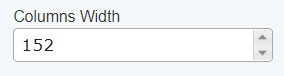


.jpg?revision=1)

.jpg?revision=1)
 (unselected)
 (selected)
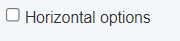 (unselected)
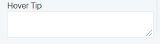
.jpg?revision=1)
.jpg?revision=1)


.jpg?revision=1)
.jpg?revision=1)

Setting Form Options
By default, labels on form fields are displayed using the Arial (regular) font face with a size of 13 points. Form options let you overwrite the default styles and specify the desired font face, size and style for various labels and fields in the form. You can set options both globally and for specific form field content. Form options are configured using the Properties Page toolbar. The following options are available:
|
Toolbar |
|
|
|---|---|---|
|
|
Global styles |
Lets you overwrite the default font face and specify the desired font face and style (bold, italic, underline) to be applied globally to all text on form fields. Global styles can be overwritten for specific form field labels and text using the options below. |
|
|
Form label | Lets you overwrite the default font face (or Global style when configured) and specify the desired font face, size and style (bold, italic, underline) to be applied to all labels on form fields. |
|
|
Area and input |
Lets you overwrite the default font face (or Global style when configured) and specify the desired font face, size and style (bold, italic, underline) to be applied to text entered by the user in text boxes. Area and input styles are also applied to Placeholder text (see Setting Field Preferences for more information). |
|
|
Subheading | Lets you overwrite the default font face (or Global style when configured) and specify the desired font face, size and style (bold, italic, underline) to be applied to subfield text on form fields (see Setting Field Preferences for more information). |
|
|
Checkbox and radio | Lets you overwrite the default font face (or Global style when configured) and specify the desired font face, size and style (bold, italic, underline) to be applied to check box and radio button labels. |
|
|
Form columns count | Lets you specify the default number of columns for the form; either One column, Two columns or Three columns. You can choose to apply the selected value to existing fields on a form, or only to new fields added to an existing form. The default value for this option is Three columns. |
.jpg?revision=1)
.jpg?revision=1)
.jpg?revision=1)
.jpg?revision=1)
.jpg?revision=1)
To display Form options in the Properties Page toolbar:
- Click the Form options link on the Form Editor tab.
- The Properties Page toolbar updates to display the available options.
- The Properties Page toolbar updates to display the available options.
Working with Sections
When you select the Create button from the Designer Homepage, the Forms Page displays, with a single section defined. Forms can be prepared as a "standalone" (single section) form containing all form fields for a workflow, or they can be divided into two or more logical groupings, or sections. There are a number of considerations in determining whether or not to sectionalize a form, including:
- Organization - You can use sections to separate a form into logical groupings based on the departments or groups in your organization responsible for the workflow (Purchasing, Shipping, Receiving, etc.).
- Ease of use and maintenance - If a form may require periodic updates or modifications, separating the form into sections can help reduce the amount of time needed to make the necessary changes.
- Controlling form access - In cases where it's desirable to suppress display of groups of form fields at one or more workflow stages, the Form access feature lets you "hide" a section of a form without the need to selectively "hide" the individual form fields.
The sections included in a form are shown at the top of the form editor field. Click a section name to view the section.
- To add a new section to a form:
-
Click the
.jpg?revision=1) icon at the top of the form editor field.
icon at the top of the form editor field.New sections are assigned a default name and number according to the sequence in which they are added to the form.
-
- To rename a section:
- Double click the section you wish to rename.
- Select the current section name, and enter the new name as desired.
- To reposition a section:
- Click and hold the left mouse button, then drag the section to the desired position.
- Click and hold the left mouse button, then drag the section to the desired position.
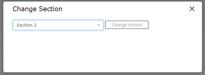
- To move a form field to a new section:
- Click the field you wish to move, then click the
.jpg?revision=1) icon in the form field tab to open the Change Section dialog.
icon in the form field tab to open the Change Section dialog. - Select the section to which you wish to move the selected from the drop-down menu. The menu lists all section in the form except the currently active section.
- Click the Change section button. The selected field is moved to the bottom of the specified section.
- Click the field you wish to move, then click the
-
To delete a section:
You cannot delete a section that contains form fields. You must first move or delete all fields contained in the section before the section can be deleted.
- Move any form fields you wish to retain to other sections of the form as described above.
- Delete any form fields you do not wish to retain in the form.
- When all fields in the section have been moved or deleted, click the
.jpg?revision=1) icon next to the name of the section you wish to delete. The selected section is deleted, and the screen scrolls to the first section of the form.
icon next to the name of the section you wish to delete. The selected section is deleted, and the screen scrolls to the first section of the form.
Creating a Thank You Page
The Thank You page is shown to a user upon completing and submitting a workflow stage. The Thank you page option in the Designer lets you create a "generic" Thank You page that applies to all stages of a workflow. It can be found under the MENU drop down on the Form page
You can also use the Thank you page property for a workflow stage relationship to create "stage specific" Thank You page that overrides the "generic" Thank You page for the workflow stage with which it is associated.
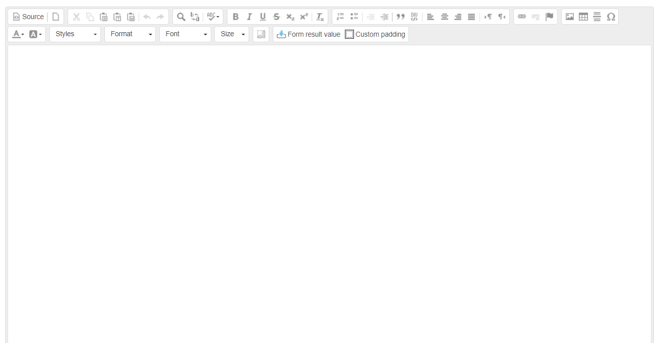
The Thank You page editor uses the Open Source CKEditor HTML editor to create Thank You page content. Click here to find information on using the features and functions available through the CKEditor.
To create a Thank You page:
- If necessary, locate and load the workflow for which you wish to create a Thank You page.
- Click the Thank you page link on the Form Editor tab.
- The Thank You page editor displays.
- The Thank You page editor displays.
- Enter and format the content for the Thank You page as desired.
- When all desired content has been entered, click the
.jpg?revision=1) Save button in the Properties Page toolbar to save your changes.
Save button in the Properties Page toolbar to save your changes.
- A confirmation popup shows the message "Form workflow successfully saved."
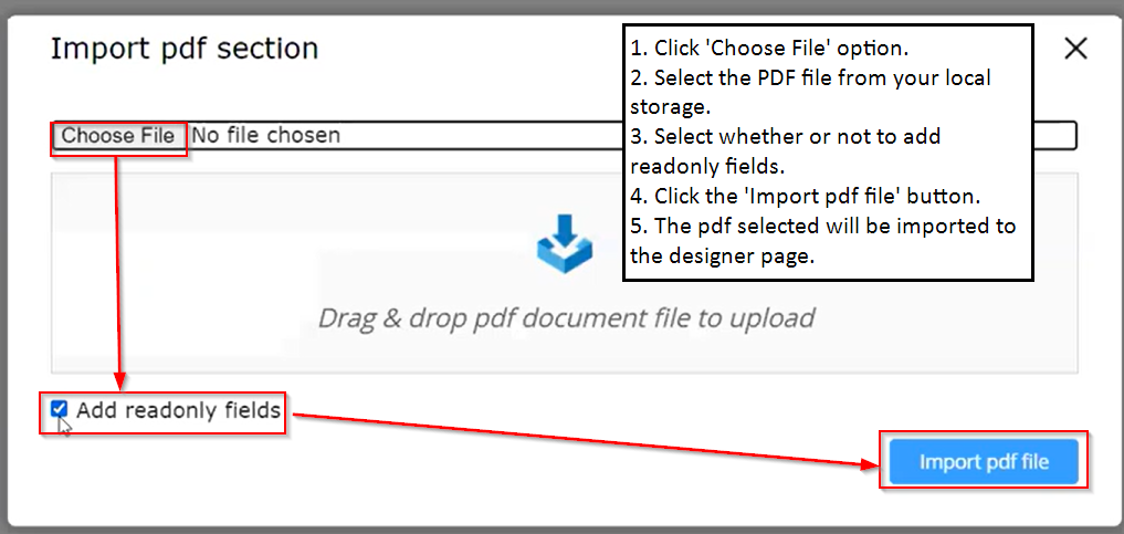
Import Form From PDF
The primary purpose of this feature is to eliminate the manual creation of various fields, such as text fields, drop-down fields, area fields, etc. It involves the incorporation of specific acro fields within the Adobe Acrobat editor. This allows for the creation of a PDF, which can subsequently be directly imported for utilization.
To import a form from a PDF file, follow these steps:
-
Navigate to the Menu Tab --> Import form from pdf.
-
Begin by clicking the 'Choose File' option.
-
From your local storage, select the PDF file of your choice.
The PDF imported form must be configured with acro fields. Otherwise, the form cannot be imported.
-
Alternatively, you have the option to simply drag and drop the PDF file onto the dialog box.
-
You have the option to specify whether to include read-only fields.
-
Now, simply click the 'Import PDF File' button.
-
The selected PDF will be brought into the designer page as a form.
Working with Record Forms
Record Forms are generally used for business processes that do not require an e-signature or other form of authorization, such as status reports, internal document distribution, etc. Record Forms are created in a similar manner as e-signature forms, using an abbreviated set of form fields.
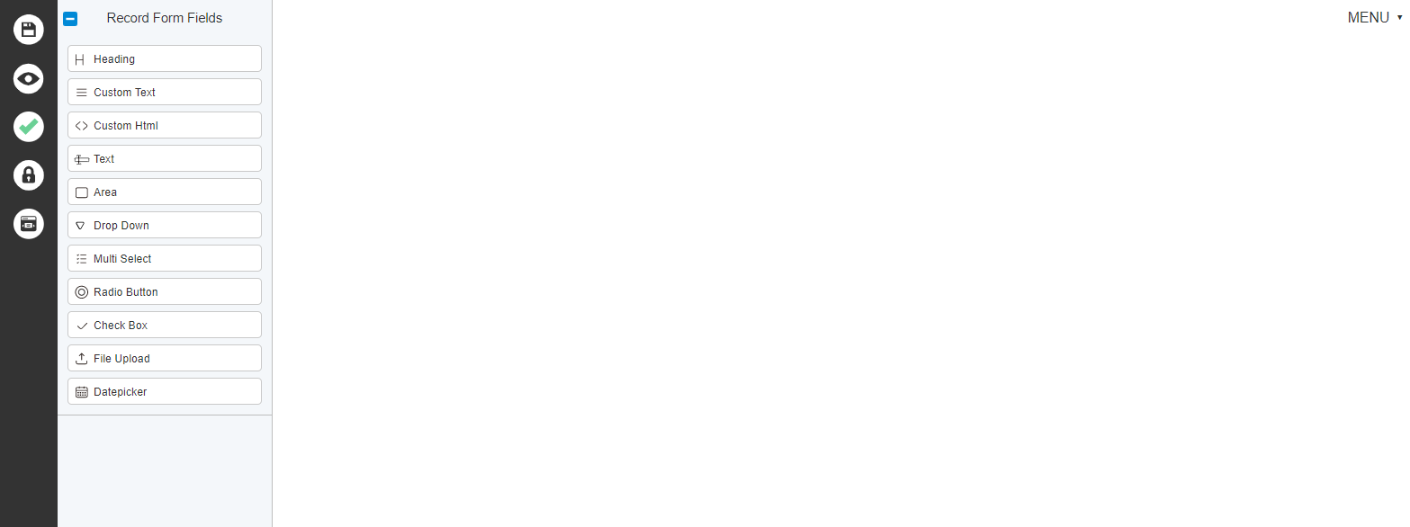
To access Record Forms:
- Click the Business Automation button in the TAP Toolbar to access the Business Automation module.
- The Designer is selected by default, and the screen displays the Designer Homepage.
- Click the Create button.
- The Designer displays the Forms - Properties page.
- Click MENU
- Under Form Editor, click Record Form
- The Designer displays the Record Forms editor page.