
TAP Analytics User Guide
Introduction to TAP Analytics
Please Note: If you currently have an analytics subscription, you can transition to TAP Analytics 2.0 when it’s most convenient for you. Please submit a customer support ticket to initiate the process.
If you do not currently have an analytics subscription and would like to learn more about the valuable insights it can provide, please contact your account manager.
TAP Analytics can streamline intricate data and convert it into robust analytical applications that can be easily shared or embedded across various platforms. By using your data, analyzing it, and visualizing the results, TAP Analytics helps accelerate business decisions and drive change. It should be noted that TAP Analytics is an analytical tool that integrates with a third-party Analytics tool to perform its functions.
The following are some examples of the data that can be analyzed:
- Average time requests spent in each status/phase
- Analyze allocation of workload between owners - number of requests per owner, average time per owner
- Number of requests by the result
Interactive dashboards offer a convenient way for users to consume and analyze multiple visualizations of comparable data on a single screen. Users can directly navigate to specific data within the dashboard for reporting purposes. With the TAP system, designers can create ad-hoc reports and dashboards that include cross-object data and reportable custom fields and objects. Additionally, the application presents a comprehensive overview of its various features.
Prerequisites
The following are the prerequisites for using TAP Analytics:
- The user needs to have a valid TAP application login and password.
- User must purchase the add-on product.
- User must have valid Sisense login credentials.
- Sisense application access to the pages where dashboards are located and the datasets are controlled.
- Users must be live in the Production environment, as TAP Analytics does not have a staging environment.
- User must have data in Production - Data is required to test and finalize reports.
Initial Configuration
To ensure that the data in the TAP application and Analytics matches, Sisense credentials must be submitted in TAP.
- Click on the Administration tab in the TAP application.
- In the User Details section → Login details, enter the Sisense username and password.
- The credentials can be locked by selecting the Locked checkbox.
- Now users will be able to view TAP Analytics.

Obtaining Valid Sisense Login Credentials:
Customers obtain their Sisense credentials through the support team. Upon downloading Analytics 2.0, customers are required to raise a ticket. Mitratech generates two sets of login credentials: one for the Data Designer role and another for the Data Viewer role. These credentials are then transmitted to the client via the support team. Upon receiving the credentials, customers can commence using Analytics according to their assigned roles.
Accessing Analytics in TAP
To access TAP Analytics, individuals must have the appropriate site-wide privileges. Furthermore, in order to access the TAP Analytics dashboards, valid Sisense credentials must be added to the user profile in TAP.
- Confirm that you have valid Sisense credentials entered into your TAP User Account.

- Click on the Reports
 tab.
tab. - Click on the Analytics option to access Analytics Dashboards.
- To modify the Analytics dataset, click on Datasets from the drop-down. The list of dataset fields for the data model is displayed. To know more about Data Model, click here.
- Note: Depending on your site privileges you may not have access to Datasets or Analytics sections. If you require access to these sections, please check with your site Admin.
User Roles and Permissions
Access Levels
Sisense dashboards in TAP provide different access levels:
- Edit Access – Modify, add, or delete widgets and dashboards.
- Read-Only Access – View dashboards but cannot edit them.
- Design Access – Customize the layout and data models.
Each user account in the application is designated a specific role that determines their level of permissions within Analytics. These permissions instruct what actions the user can perform. Generally, the application has two distinct roles.
Data Designer: The Data Designer performs the following functions:
- Adds, edits, or deletes the fields in the dataset.
- Triggers Build in the dataset.
- Creates widgets.
- Shares Analytics dashboards with users and has the ability to modify and refresh data to synchronize it with the viewer.
- Creates filters.
Data Viewer: The Data Viewer has the following functions and limitations:
- Has read-only access to the dataset.
- Cannot directly access datasets.
- Can only access dashboards shared by the Data Designer.
- Cannot create filters or refresh data. Any modifications or updates to the data are visible only after the Data Designer refreshes the dashboard.
What is a Data Model?
A data model is a framework that outlines how data is imported, stored, and retrieved to facilitate data analysis. In TAP Analytics, this is the object utilized to hold the data, which is then leveraged to create the dashboards. The data model is represented by the dataset fields in TAP Analytics. It's worth noting that the application has pre-existing data models.

Types of Dataset Fields
We have two types of dataset fields:
- Static Fields: There are a set of Static Fields that cannot be removed from the list though there is a cross
 symbol beside it. These are default fields that are present for every tenant every time.
 - Dynamic Fields: The dynamic fields added can be removed at any time by clicking the Save button. These fields are populated from the workflows that are generated by the users.
Refer to the Dataset Field Glossary for detailed information on each dataset field and its respective function.
Updating a Data Model
To preview the TAP workflow options in Analytics, the data model needs to be updated. The additional fields added in the data model/ data set are visible in Analytics in the Fields table.
When setting up Analytics for the first time, access to your site's default data fields will be provided. However, to report on specific form fields, you can update the site Data Model by adding individual fields. The dataset page provides a comprehensive list of dataset fields and associated details.
To update or modify a data model,
-
Select the dynamic fields from the drop-down list under the dataset fields and click Add.

-
Once you add all the required sets of fields, click Save at the bottom of the list. The page refreshes.
Note: Saving will only display the added field in the current view and will get pushed into TAP Analytics when the build happens in the backend.

-
Once the build is successful at the backend, the data is pushed into the data model in TAP Analytics.
-
The data model is finally displayed in TAP Analytics.
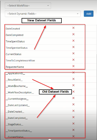
Update Dataset Fields
Data set fields in Analytics will now appear in a more user-friendly manner. The static dataset fields that appear now have underscores prefixed and suffixed. These dataset fields that appear within underscores '_', must be changed to the field names as in TAP which do not have these symbols.
- Open the data model in Analytics.
- Select any option from the Dynamic Fields dropdown to display the new fields. Click the Add button.
- Click the Save button. The page automatically refreshes and new static columns with friendly names are displayed.
- Delete the old static fields by clicking the cross icon.
- Two field names have been changed.
- ‘ResultSetID’ is changed to ‘WorkflowID’
- ‘StageStatus’ is changed to 'TimeSpentStatus’.
Note: The dataset fields earlier present will now become dynamic and the current fields added will become the static fields and cannot be removed.
Dataset Field Glossary
|
Dataset Field |
Function |
Recorded in |
|---|---|---|
|
WorkflowID |
ID of the workflow |
GUID value |
|
WorkFlowName |
Name of the workflow |
String |
|
WorkFlowDescription |
Description of the workflow |
String |
|
CurrentAssignee |
The current assignee to the workflow. |
String |
|
DateLastUpdated |
The date the workflow was last updated. |
Date and Time as YYYY-MM-DD HH:MM:SS |
|
DateCreated |
The date the workflow is created. |
Date and Time as YYYY-MM-DD HH:MM:SS |
|
DateCompleted |
The date the workflow is completed. |
Date and Time as YYYY-MM-DD HH:MM:SS |
|
TimeSpentonStatus |
The time spent on the current status of the workflow. |
Minutes; Rounds up or down based on every 30-second interval. |
|
TimeSpentStatus |
The status of the workflow that corresponds to the TimeSpentOnStatus value. |
String |
|
CurrentStatus |
The current status of the workflow. |
String |
|
TimetoCompleteWorkflow |
The time taken to complete the workflow. |
Hours; Rounds up or down based on 30-minute intervals. |
|
RequesterName |
The name of the requester. |
String (Character limit 150) |
Data Type Validation
Any form fields identified as date, numeric, or currency will have corresponding validations applied to their data types when transferred to Sisense.
By default, the following data type validations will occur:
- Date field is imported as a DateField type, enabling filtering options such as 'Before X date' and 'Later than X date'.
- Text boxes with numeric validation are imported as integers
- Text boxes with decimal validation are imported as decimals
- Text boxes with currency validation are imported as decimals
Dashboard Layout and Key Elements
Dashboard Header
- Displays the dashboard name on the left-hand side.
- Shows the last data refresh timestamp, which is updated automatically, typically once per night.
- Sisense refers to datasets as EQ (Elastic Cubes), which serve as the data sources for the dashboard.
Dashboard Controls
- The dashboard controls panel includes tools for adding and modifying widgets.
- Users can manually trigger a data refresh for updated information.

Adding and Managing Widgets
What is a Widget?
A widget is a visual element that represents data. Examples include:
- Indicators
- Area Charts
- Pie Charts
How to Add a Widget?
- Click the yellow plus icon in the dashboard controls.
- You can either go with the simple setup and select your data right there, or skip to Advanced Configuration if you need more control.
- Choose the widget type (Indicator, Chart, Text, etc.) Each one will give you different options depending on the data structure:
- Indicator shows a value (like a number).
- Pie and Bar charts use categories and values, with bar charts also supporting a "break by" option.
- If you're creating an Indicator, and you want to show the number of records, select something like workflow id as your value. Since it's a text field, it’ll default to "count unique," which gives you the total number of records.
- You’ll see a visual preview on the right. You can change how it looks — like switching between number and gauge — and each widget type has its own display options.

- To show only completed records, add a filter. Filter by Current Assignee and set it to empty (NA). This filters out any records that are still in progress.
- You can change the title by double-clicking it. For example, rename it from "Number of unique workflow id" to something clearer like "Number of Records." You can also give the whole widget a title like "Number of Completed Records Total" by clicking at the top.
- When the widget is created, it’ll be added at the bottom of the dashboard. You can drag and drop it to move it wherever you want — top, middle, or its own row.
Adding Text to the Dashboard
- Users can add text-based widgets using the "Add Text" button.
- Formatting options allow customization of text color, size, and placement.
- Text is inserted directly into the dashboard and can be adjusted as needed.
Deleting a Widget
Users can delete widgets by clicking the right-hand options menu and selecting "Delete."
Update your Analytics Dashboard
Users who have been granted 'edit' permission in their Sisense user profiles will have the ability to modify the analytics dashboard that is linked to their TAP tenant. To accomplish this, users must first navigate to the Analytics section within TAP and then load the desired dashboard.

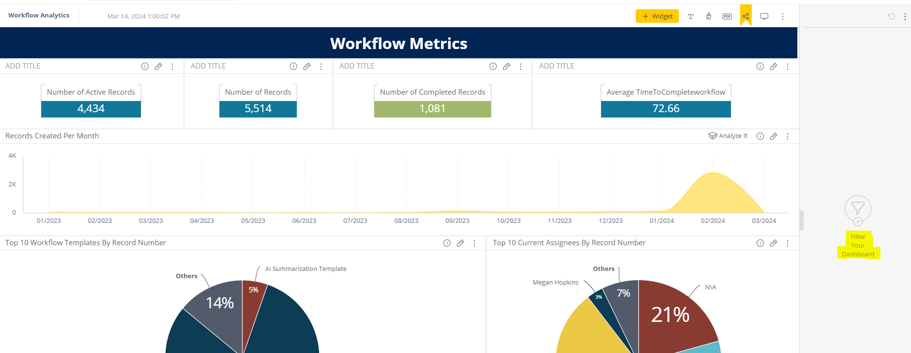
A user with edit permissions will see the header bar. In order to add a new widget, select the ‘+ Widget’ button at the top.

Once this has been selected, you will be asked to add data. All data points that have been added to your dataset will be available to select. In the above image, we’ve selected the Date Created data field, which is designated as a date. Users can then select the type of widget they would like to create from the left-hand sidebar:

In this case, a bar chart has been selected. Additional data can be selected by clicking the yellow ‘+’ icon. By doing this, you can create more complex widgets. In the above image, we’ve added ‘# of unique Result Set Ids’ as an additional data point, which allows us to display the number of unique records created each year.
When selecting and adding data to a widget, you can control the format of the data being used. By right-clicking on the data point you can choose from these formatting options:

IMPORTANT: To filter or add the ‘number of unique workflow records’ datapoint to a widget, you should use either result set ID or Workflow name. You can then select that data point and click the ‘Type’ option. This allows you to designate it as ‘Count Unique’ and will give you a count of the unique workflows within your Tenant.
You can also enter more advanced configurations by clicking the ‘Advanced Configuration’ option in the bottom left. This is where you can change the layout of the widget and also add filters to your widget.
After configuring your new widget, you can add it to your dashboard by clicking the yellow ‘Create’ button at the bottom right-hand side of the popup. Widgets can be resized and moved around the dashboard using drag-and-drop functionality. You can also rename the widget by clicking the ‘Add Title’ or existing title area of the widget, and enter your new title.
To edit an existing widget, click the pencil icon in the top right corner of the widget:

The widget editor will bring you to the ‘Advanced Configuration’ screen for your widget:

On the right-hand side, filters can be configured and the layout of the widget can be controlled. Users can switch between the two options by clicking the ‘Filters’ and ‘Design’ headers at the top of this section. On the left-hand side, you can edit the data being used in this widget and add additional options to how that data is formatted. To save changes to your widget select the ‘Apply’ button. Select the' Cancel' button if you do not wish to save changes.
For help with any of this functionality, please contact our Support team. You can also view a Sisense-created video series on dashboard creation here. Please note that some of the functionality mentioned in this video series may not be available for TAP clients utilizing embedded Analytics dashboards.
Customizing the Dashboard
Changing the Dashboard Color Palette
- Users can manually assign colors to widgets or select a default color palette for consistent styling.
- The selected palette ensures all widgets have the same color scheme.

Exporting as a PDF
- Users can configure PDF report settings to export the dashboard.
- Options include:
- Portrait or landscape orientation
- Showing or hiding headers
- Additional formatting settings

Advanced Widget Configuration
Widget Types
There are a variety of options and configurations that can be done within the Advanced Widget Configuration window. Firstly, users can select or update the Widget type that is being used. To do this, select the Widget type in the left-hand dropdown:
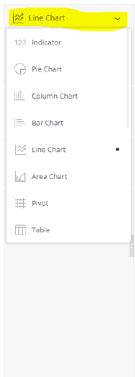
The following is a list of widget options available within Sisense:
| Widget Type | Description |
| Area Chart | An Area Chart is very similar to a Line Chart except that the areas under each line are filled in (colored), and it is possible to display them as stacked. The chart is recommended for displaying absolute or relative (stacked) values over a time period. |
| Area Map | Area Maps allow you to visualize geographical data as polygons on a map. |
| Bar Chart | The Bar Chart is commonly used to compare many items. The Bar Chart typically presents categories or items (descriptive data) displayed along the Y-Axis, with their values displayed on the X-Axis. You can also break up the values by another category or groups. |
| Box and Whisker Plot | The Box & Whisker Plot, or Box Plot, widget is a convenient way of visually describing the distribution, variability, and center of a data set along an axis. |
| Calendar Heatmap | The Calendar Heatmap widget visualizes values over days in a calendar-like view, making it easy to identify daily patterns or anomalies. |
| Column Chart | The column chart can be used in different business scenarios, especially for comparing items, and comparing data over time. The chart can include multiple values on both the X and Y-axis, as well as a break down by categories displayed on the Y-axis. |
| Funnel Chart | The funnel chart shows stages in a process that are sequentially dependent. The funnel shape helps you track the health or validity of any process. |
| Indicator | The Indicator widget provides various options for displaying one or two numeric values as a number, gauge or ticker. It also provides the option to add additional titles and a color-coded indicator icon representing the value, such as a green up arrow or a red down arrow. |
| Line Chart | The Line Chart can be used to compare data over time, or to compare changes over time for more than one group or category. |
| Pie Chart | The Pie chart is used to display proportional data, and/or percentages. |
| Pivot Table | Pivot tables are one of the most useful widgets for visualizing data. They enable you to quickly summarize and analyze large amounts of data. |
| Polar Chart | Use the polar (radar) chart to compare multiple categories/variables with a spacial perspective in a radial chart. |
| Scatter Chart | The Scatter Chart displays the distribution of two variables on an X-Axis, Y-Axis, and two additional dimensions of data that are shown as colored circles scattered across the chart. |
| Scatter Map | Scatter Maps allow you to visualize geographical data as data points on a map. Sisense uses a cloud service to load the background tiles of the map, and position data points on the map using a geocoding service. |
| Sunburst | The Sunburst widget is similar to a pie chart but is multi-dimensional. Whereas a pie chart combines one field and one numeric value, the Sunburst widget can display multiple rings, one for each field. Each ring in the Sunburst shows a breakdown of its parent ring slice. |
| Table | The Table widget displays a broader view of your data, presenting it in columns, with as many fields and as much metrics as necessary, tailored to your needs. |
| Treemap | The Treemap is a multi-dimensional widget that displays hierarchical data in the form of nested rectangles. This type of chart can be used in different scenarios, for example, instead of a column chart if you have to compare too many categories and sub-categories. |
Filters
Widget specific filters can be added by using the Filters configuration on the right hand side:
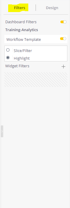
Widget-Level vs. Dashboard-Level Filters
Users can add filters at both the widget level and the dashboard level:
- Widget-Level Filters: Applied to individual dashboard components.
- Dashboard-Level Filters: Applied to the entire dashboard and impact all widgets.
To apply a filter at the widget level, open the widget’s configuration settings and select the appropriate filtering criteria. To apply a filter at the dashboard level, use the ‘Filter Your Dashboard’ option and set global filtering rules.
If there are Dashboard Filters created, they can be applied to the widget by clicking the 'Dashboard Filters' switch and then selecting the corresponding switch that applies to the Dashboard Filter you would like to add. Individual widget filters can be added by clicking the '+' icon. Users can then select the data point that they would like to filter on. Common filters include:
Workflow Description - Filter on this data point if you would like to see data for a specific workflow template or templates. This allows users to view data from certain templates instead of seeing all record data.
Current Assignee - Filter on this data point if you would like to filter by active/inactive record status. By filtering out the N/A current assignee value you can see only data from records which are currently active, or by filtering only the N/A value you can see only data from records which have been completed.
Current Status - Filter on this data point to see data from records that corresponds to a specific status. This allows you to filter data by where in the process a record currently is.
Widget filters are applied only to the selected widget. If a user wants a widget to be available for the entire dashboard, a dashboard filter needs to be used. This can be configured by selecting the right hand side 'Filter Your Dashboard' option when viewing the entire dashboard:
Dashboard filters are configured in the same way as widget filters but apply to all widgets on the dashboard.
Widget Design
The look and style of a widget can be configured by using the 'Design' options on the right-hand side of the advanced widget configuration window:
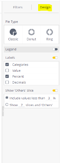
Each widget type has different visual options that can be set. More information on the visual options for each widget type can be found by accessing the widget type links in the widget type table above.
Data Sync between users
If a user has been granted "Can Design" permission, the "user" endpoint instance will be utilized by the application. In this scenario, any changes made to the widget, filters, etc., will only be visible to that particular user and not to other users who have accessed the data model via the Share option. Only if the user edits and "Republish" the dashboard it will overwrite the data in the "proxy" endpoint instance and the changes will be visible across multiple users who have access to the dashboard.
Republishing and Sharing the Dashboard
Republishing Changes
- When changes are made, a yellow highlight appears to indicate pending updates.
- To make changes visible to users with view-only access, click "Republish."
Switching Between View and Development Mode
These advanced options are available only to Editors & Developers. They allow editing data scripts or embedding code, features that are rarely used and are restricted to users with edit permissions. Additionally, only Designers can switch between view mode (for previewing the dashboard) and development mode (for making edits).
Creating Additional Dashboards
To create additional dashboards, access the Sisense main site here. Users can create a new dashboard by selecting the '+' icon on the left-hand side and then selecting 'New Dashboard' from the options:
Users will then be prompted to select a data source (only one should be available) and enter a title for the new dashboard. After that, the dashboard will be available within TAP. To add additional viewers to a dashboard select those viewers when publishing and republishing the dashboard.
Trouble Shooting Issues
- The dashboard may load, but some or all widgets may display errors, such as an exclamation mark or no data. This typically indicates a problem with the Elasticube (EQ) data model.
Resolution: The issue may stem from a failed or incomplete EQ build. Reach out to the Support was to check whether the EQ build was completed successfully. If the build has failed or timed out, the Support team should be able to either rebuild the Elasticube or resolve any underlying configuration issues to restore proper widget functionality. - Dataset Page Not Loading or Not Available
Resolution: Start by checking whether the user can see the dataset option in the dropdown menu.
- If they can’t see it, it’s a permissions issue. Update the user’s permissions and ensure they have a role that grants access to the dataset page.
- If they can see the dataset, but clicking on it results in an error like “This isn’t set up” or “You don’t have access,” contact the Support Team to resolve the problem.