
InvoiceIQ - Vendor Comparative Dashboard
TeamConnect Business Intelligence coupled with the InvoiceIQ module provides a number of starter dashboards. These dashboards can be tailored to your individual requirements, as they might work better with customization, and you might need to remap certain fields based on your data model.
The minimum version that supports this starter dashboard is TCE 6.3.5, TCBI 6.3.0, and InvoiceIQ 1.1.
Introduction
The Comparative Dashboard shows the performance of a law firm compared to other selected law firm(s) with InvoiceIQ metric overviews using widgets. The Diversity Comparison dashboard compares the distribution of hours and fees by gender or race of one law firm with a selected law firm or group of law firms. This helps to see whether the diversity goals specific to the organizations are achieved or not.
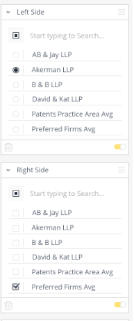
The most important aspect of these comparative dashboards is the ability to filter a firm and compare it to a filtered group of firms, The Vendor Comparative dashboards provide the opportunity to compare a firm with a selected firm or group of firms side-by-side (left vs right . You can select the options on the filter we generally see on the right side of the screen. All of these dashboards will have two law firm filters that control the right and left sides of the dashboard respectively. When a user applies changes to these filters, like selecting a firm or group of firms , these settings will be saved the next sessions too. This is helpful when the comparison firms are fairly static, such as when you want to compare a firm with a group of preferred counsel firms, where you can multi-select the preferred firms in the ‘Right Side’ filter.
Note: The dashboard is most dependent on the InvoiceIQ Data. If the client does not leverage some parts of the system, the resultant dashboard may not provide the expected insights (Widgets may be empty). For example the Diversity Comparative Dashboard is leveraging diversity information from Collaborati.
Sample 1: This is the dashboard view, if no firms are selected for comparison in the left side and right side filters.

Note: It is possible for both the left and right widgets to be empty if they are set to a firm that does not exist in the environment. For the current saved dashboard, the Left Side widget defaults to a Firm which does not exist in the environment; therefore, it can be empty. Right Side widgets are defaulted to "exclude N/A", so they cannot be empty unless there are no invoices for the firm.
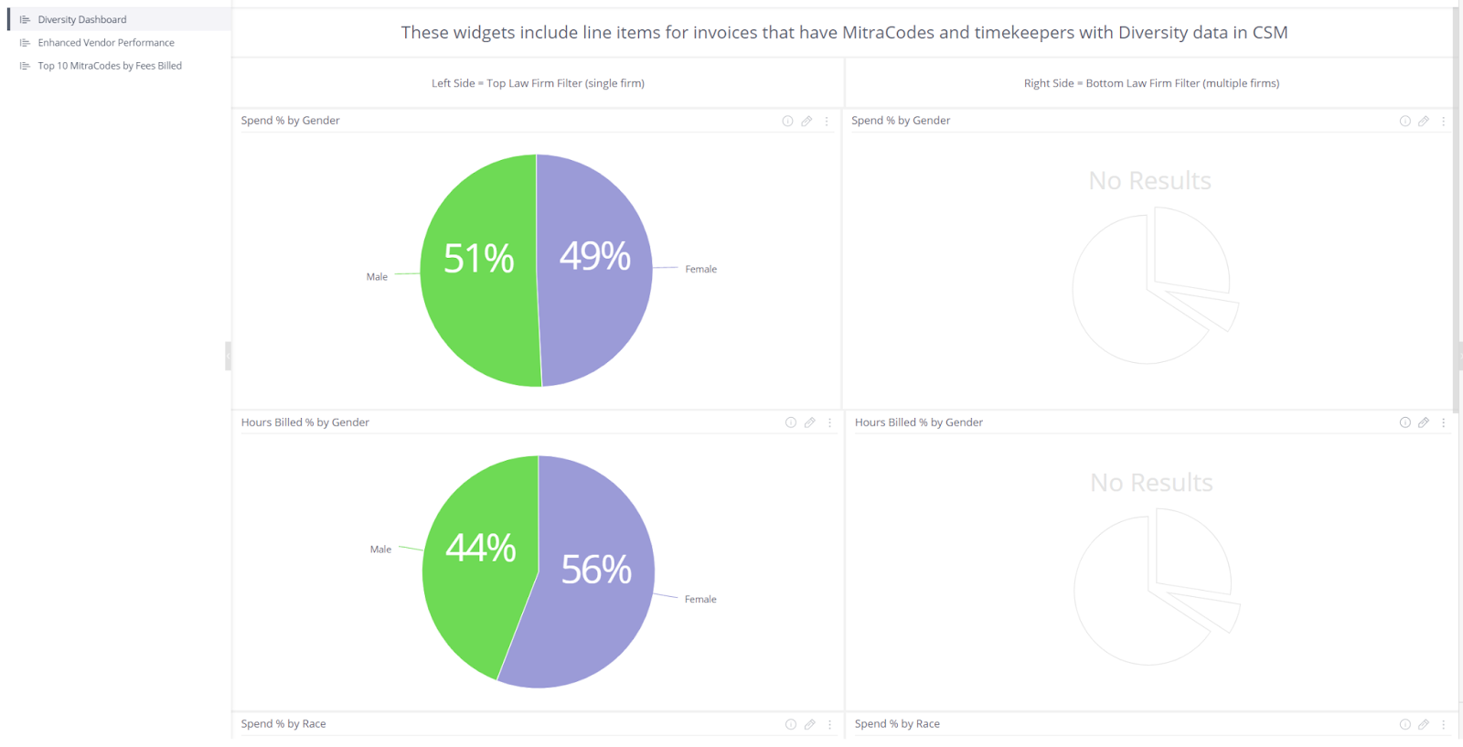
Sample 2: This is the dashboard view if the firm(left side filter) is selected for comparison, but the firm(s) (right side filters) is/are not selected for comparison.
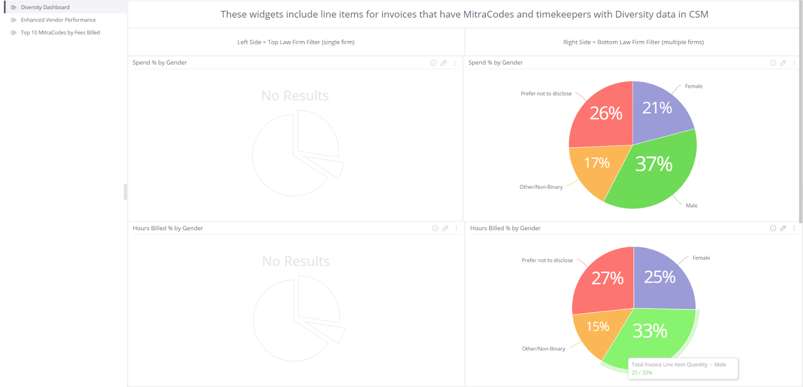
Sample 3: Here is the dashboard view , if no firm(left side filter is selected for comparison along with group of firm(s).
The Left Side filter should be disabled or Removed in the widget level for all Right side widgets. It is taken that when both left and right side filters are enabled, only the left side filter is openly enabled and gives results accordingly.
By default, all the left widgets follow the "Left Side" filter, and the right side widgets follow the "Right Side" filter. The report developer shouldn't modify this setting; otherwise, the report will behave differently.
For more information about configuring embedded dashboards, please refer to this link .
MitraCodes are Mitratech’s proprietary code for categorizing activities and expenses in InvoiceIQ and it is beneficial to clients in providing insights about law firms and attorneys activities.
There are five Vendor Comparative Dashboards:
- Diversity Comparison
- Fees Comparison by MitraCode
- Expenses Comparison by MitraCode
- Invoice Compliance Comparison
- Timekeeper Rates Comparison
Invoices are submitted in the vendor’s currency. As a result, the reporting on invoices must be normalized to the system currency in order to allow for consistent comparisons. Therefore all of the monetary fields on the dashboards are taking the exchange rate for the invoice into account. The exchange rate is captured on the invoice from the exchange rate table when the invoice is approved and posted. These are widgets that normalizes to system currency:
- Spend Percentage by Gender
- Spend Percentage by Race
- Top 10 MitraCodes by Fees billed
- Expenses by MitraCode
- Average Timekeeper Rate by Category for the last 5 Years
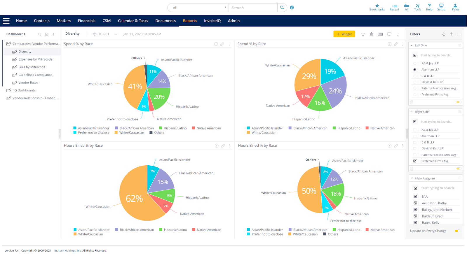
Diversity Comparison
As part of the Vendor comparative dashboard, the Diversity Comparison dashboard allows the user to compare the distribution of hours and fees by gender or race for a specific firm and those for multiple firms or preferred firms to see the diversity goals on specific areas, as following widgets in the dashboards:
- Spend by Gender
- Hours by Gender
- Spend by Race
- Hours by Race
Widgets include line items for invoices with MitraCodes and timekeepers with Diversity data in CSM. These widgets exclude line items without MitraCodes and timekeepers without Diversity data from CSM.
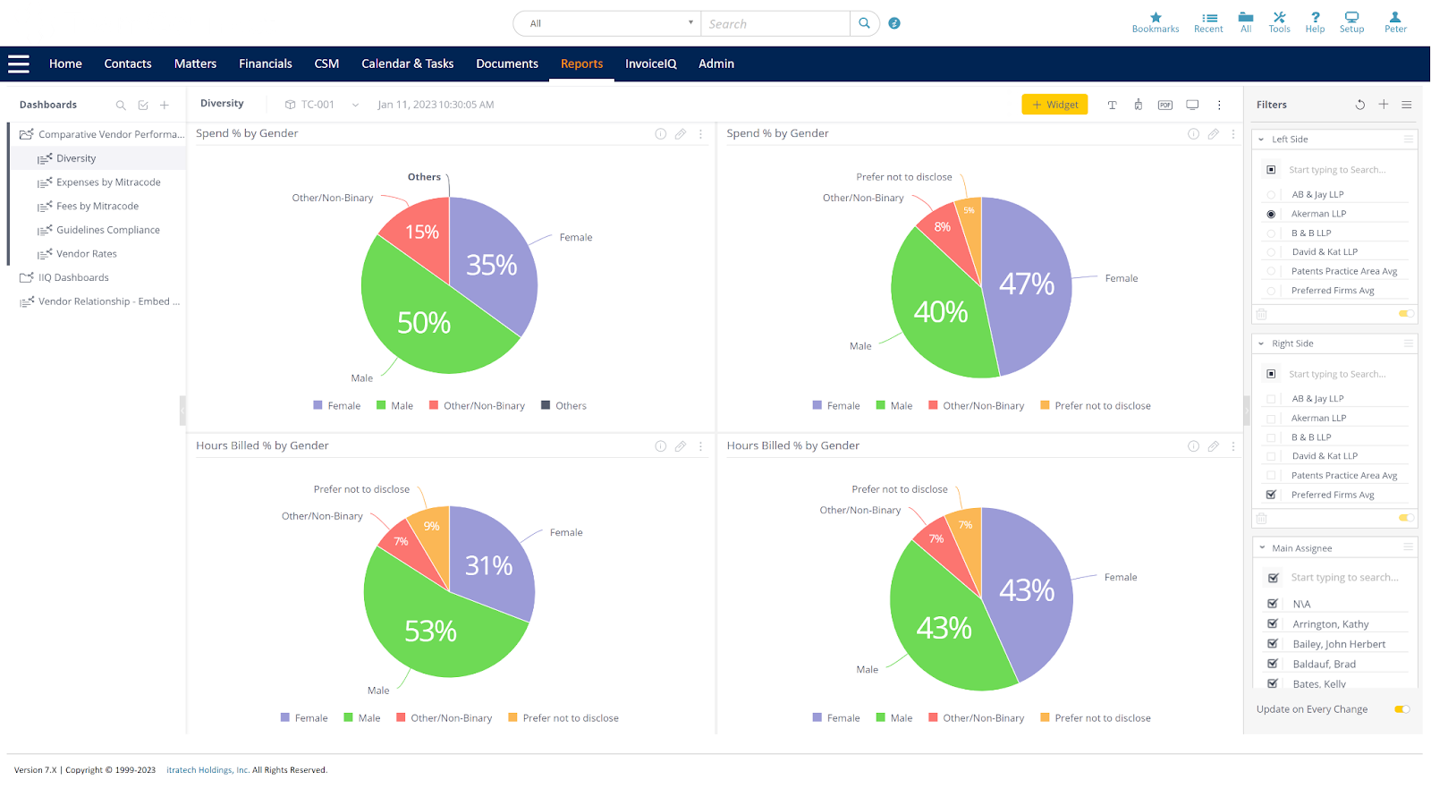
Spend Percentage by Gender
This Widget Spend Percentage by Gender shows the spend by gender for a specific law firm compared to other specified law firm(s).The source data is invoice line items for fee lines with service dates within the last 12 months. The report will only include Standard invoices with a posting status of Posted. This can be visualized using pie charts as shown:
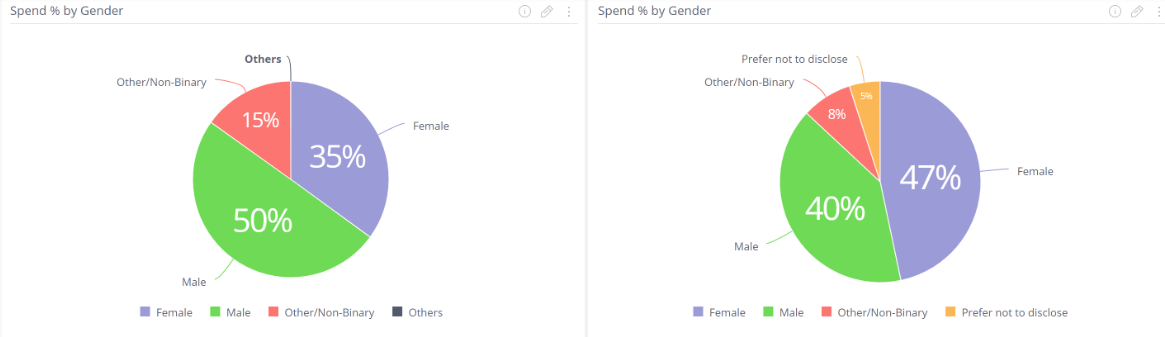
The currency information in the spend by gender comparison widget has been normalized into the system currency i.e., the values of invoices which were submitted in the currency different from system currency will be automatically converted to the system currency.
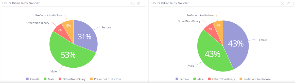
Hours Billed Percentage by Gender
This Widget Hours Billed Percentage by Gender shows the percentage of Hours billed by gender for a specific law firm compared to other specified law firm(s). The source data is invoice line items for fee lines with service dates within the last 12 months. The report will only include Standard invoices with a posting status of Posted. This can be visualized using pie charts as shown:
Spend Percentage by Race
This Widget Spend Percentage by Race shows the spend by race for a specific law firm compared to other specified law firm(s).The source data is invoice line items for fee lines with service dates within the last 12 months. The report will only include Standard invoices with a posting status of Posted. This can be visualized using pie charts as shown:
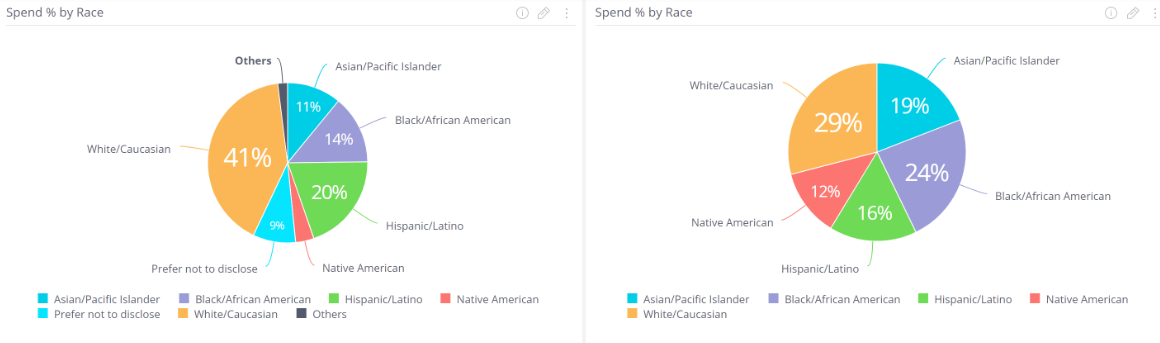
The currency information in the spend by race comparison widget has been normalized into the system currency i.e., the values of invoices which were submitted in the currency different from system currency will be automatically converted to the system currency.
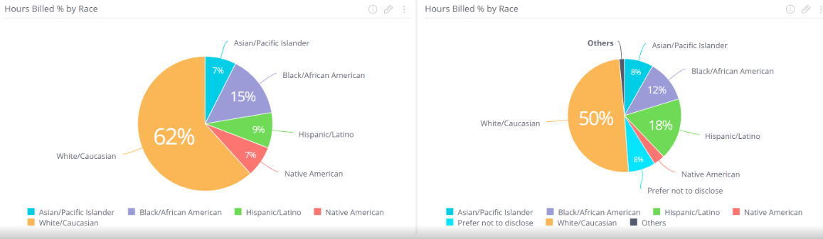
Hours Billed Percentage by Race
This Widget Hours Billed Percentage by Race shows the percentage of Hours billed by race for a specific law firm compared to other specified law firm(s). The source data is invoice line items for fee lines with service dates within the last 12 months. The report will only include Standard invoices with a posting status of Posted. This can be visualized using pie charts as shown:
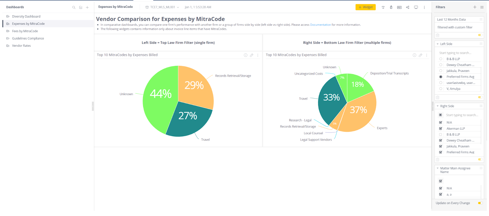
Vendor Comparison for Expenses by MitraCode
Expenses by MitraCode Comparison Dashboard allows users to compare expenses by MitraCode for a specific firm and those for multiple firms or preferred firms to see the cost and time spent on specific areas. As part of the Vendor comparative dashboard, expenses by MitraCodes comparison dashboard report provides users a quick overview of metrics, as widgets in the dashboards.
The Helper text in the Expenses by MitraCode Comparison Dashboard has two lines of information. First line is about Expenses by MitraCode Comparison dashboard and provides a reference to detailed information. And the second line is about widgets included in the dashboard. Also has headers under the Dashboard header stating about the filters that Left Side = Top Law Firm Filter (single firm) and Right Side = Bottom Law Firm Filter (multiple firms).
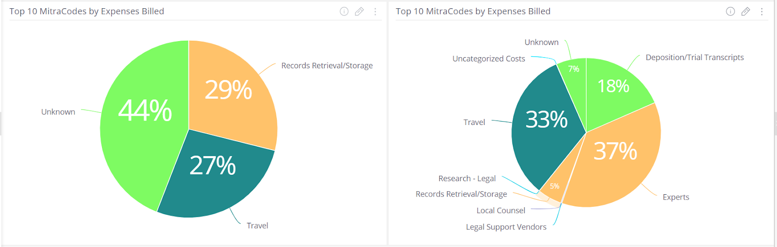
Expenses by MitraCode
This Widget Expenses by MitraCode shows expenses by Mitracode for a specific law firm compared to other specified law firm(s).The source data is invoice line items for expenses with service dates within the last 12 months. The report will only include Standard invoices with a posting status of Posted. This can be visualized using pie charts as shown:
The currency information in the Expenses by MitraCode comparison widget has been normalized into the system currency i.e., the values of invoices which were submitted in the currency different from system currency will be automatically converted to the system currency.
Vendor Comparison for Fees by MitraCode
Fees Comparison by MitraCode Dashboard allows users to compare the hours and fees spent by a specific firm with those spent by multiple firms or Preferred Firms to determine how much time and money is spent on specific areas. As part of the Vendor comparative dashboard, the Fees Comparison dashboard report provides users with a quick overview of metrics, as following widgets in the dashboards:
- Top 10 MitraCode by Fees billed
- Top 10 MitraCode by Hours billed
- Summary of Fees by Top 5 MitraCodes and Top 4 Positions
The Helper text in the Fees Comparison by MitraCode Dashboard has two lines of information. First line is about Fees Comparison by MitraCode dashboard and provides a reference to detailed information. And the second line is about widgets included in the dashboard. Also has headers under the Dashboard header stating about the filters that Left Side = Top Law Firm Filter (single firm) and Right Side = Bottom Law Firm Filter (multiple firms).
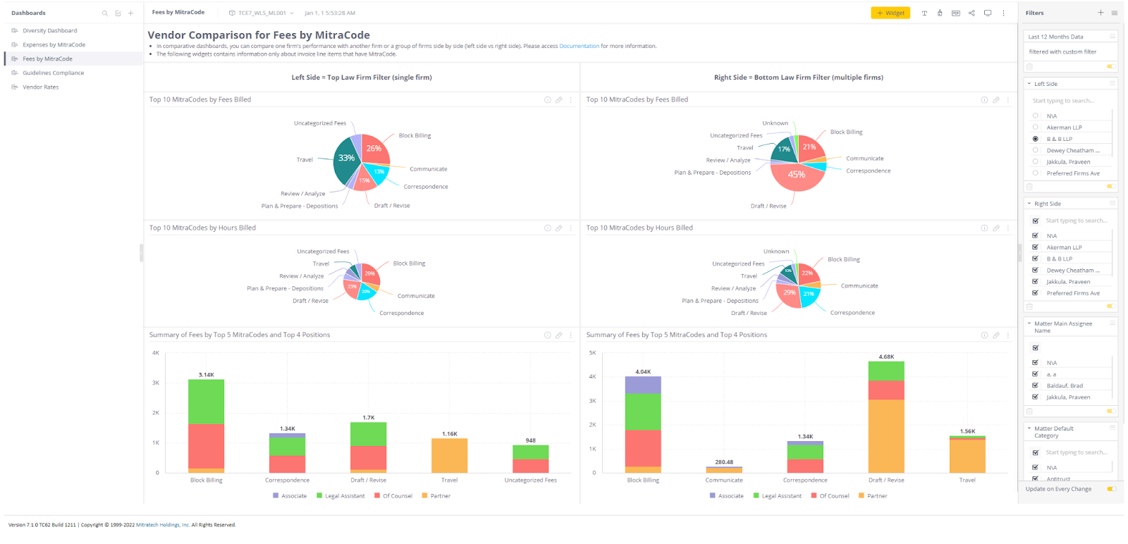
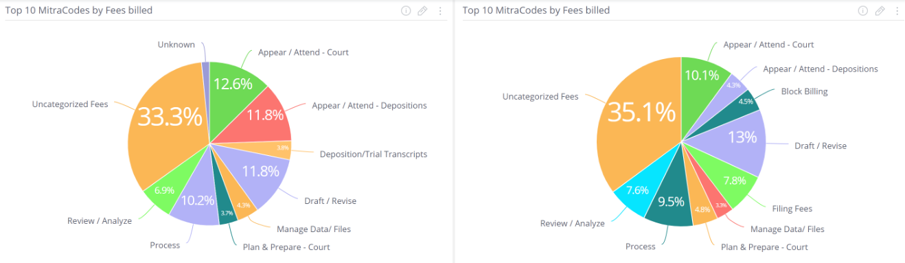
Top 10 MitraCodes by Fees billed
This Widget Top 10 MitraCodes by Fees billed shows the top 10 MitraCodes by fees billed for a specific law firm compared to other specified law firm(s).The source data is invoice line items for fee lines with service dates within the last 12 months. The report will only include Standard invoices with a posting status of Posted. This can be visualized using pie charts as shown:
The currency information in the Fees Comparison by MitraCode widget has been normalized into the system currency i.e., the values of invoices which were submitted in the currency different from system currency will be automatically converted to the system currency.
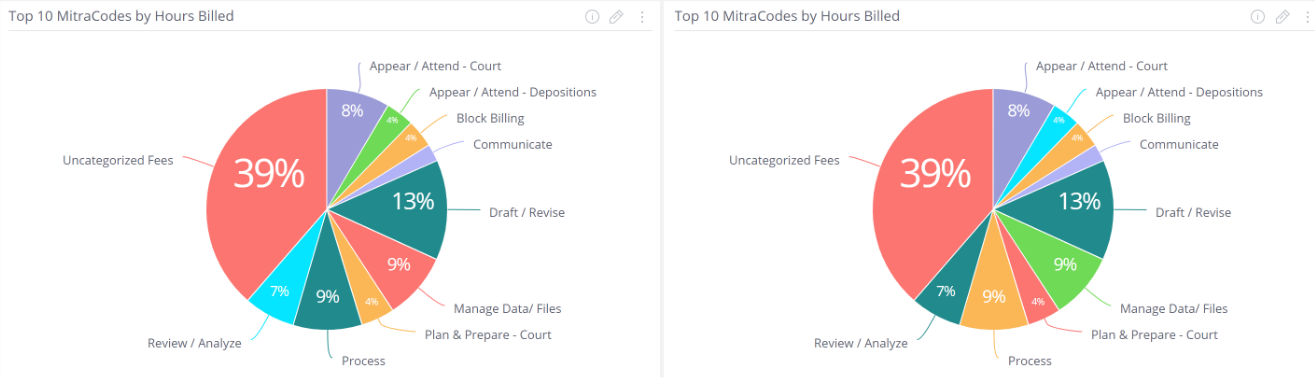
Top 10 MitraCodes by Hours billed
This Widget Top 10 MitraCodes by Hours billed shows the top 10 MitraCodes by hours billed for a specific law firm compared to other specified law firm(s).The source data is invoice line items for fee lines with service dates within the last 12 months. The report will only include Standard invoices with a posting status of Posted. This can be visualized using pie charts as shown:
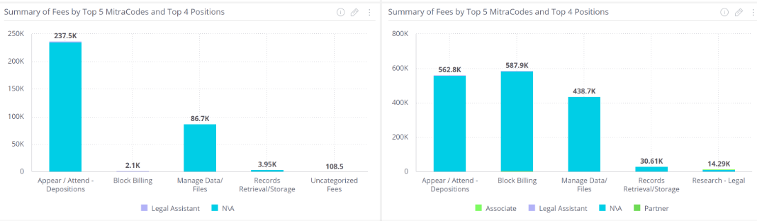
Summary of Fees by Top 5 MitraCodes and Top 4 Positions
This Widget Summary of Fees by Top 5 MitraCodes and Top 4 Positions shows the information related to summary of fees charged with respect to MitraCodes by top 4 Positions for a specific law firm compared to other specified law firm(s). The source data is invoice line items for fee lines with service dates within the last 12 months. The report will only include Standard invoices with a posting status of Posted. This can be visualized using bar diagram as shown:
Vendor comparison for Guidelines Compliance
Vendor comparison for Guidelines Compliance dashboard allows you to look at where adjustments are occurring on invoices. These dashboards represent the counts of adjustments rather than the value of them. The dashboard points out areas where a specific firm has more compliance issues than all or a group of firms. Therefore, this dashboard is representing the number of adjustments for a Mitracode as a percentage of all of the adjustments.
The Helper text in the Guidelines Compliance Dashboard has two lines of information. First line is about Guidelines Compliance dashboard and provides a reference to detailed information. And the second line is about widgets included in the dashboard. Also has headers under the Dashboard header stating about the filters that Left Side = Top Law Firm Filter (single firm) and Right Side = Bottom Law Firm Filter (multiple firms).
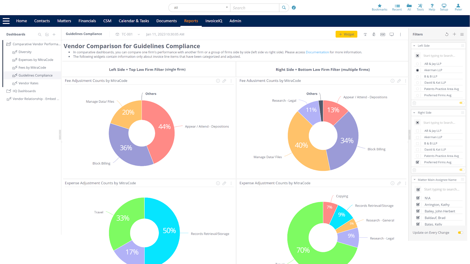
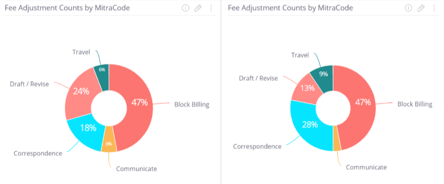
Fee Adjustment Counts by MitraCode
This Widget Fee Adjustment Counts by MitraCode shows count of fee adjustment by MitraCode for a specific law firm compared to average count of other specified law firm(s).The source data is invoice line items for expenses with service dates within the last 12 months. The report will only include Standard invoices with a posting status of Posted. This can be visualized using pie charts as shown:
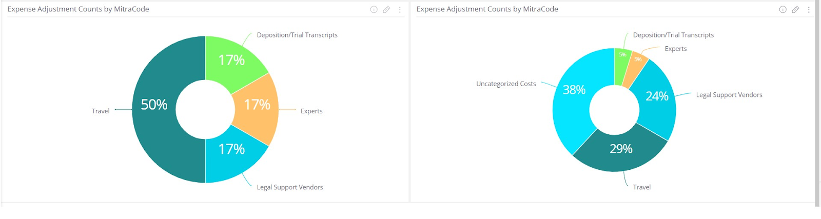
Expense Adjustment Counts by MitraCode
This Widget expense Adjustment Counts by MitraCode shows count of expense adjustment by MitraCode for a specific law firm compared to average count of other specified law firm(s).The source data is invoice line items for expenses with service dates within the last 12 months. The report will only include Standard invoices with a posting status of Posted. This can be visualized using pie charts as shown:
Vendor Comparison by Rates
Vendor Rates Dashboard allows users to compare billed timekeeper rates for a specific firm and those for multiple firms or preferred firms using the invoice line items. As part of the Vendor comparative dashboard, vendor rates dashboard report provides users a quick overview of metrics, as following widgets in the dashboards:
- Billed Rates by Timekeeper for the last 12 months
- Average Timekeeper Rate by Category for the last 5 Years
The Helper text in the Vendor Rates Dashboard has one line of information about Vendor rates dashboard and provides a reference to detailed information. Also has headers under the Dashboard header stating about the filters that Left Side = Top Law Firm Filter (single firm) and Right Side = Bottom Law Firm Filter (multiple firms).
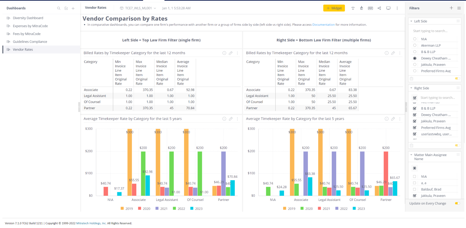
Billed Rates by Timekeeper for the last 12 months
This Widget Billed Rates by Timekeeper for the last 12 months shows the billed rates comparison by timekeeper level for a specific law firm compared to other specified law firm(s).The source data is invoice line items for task or expense, invoice type and invoice posting status with service dates within the last 12 months without the intervention of the timeline filter. The report will only include Standard invoices with a posting status of Posted. This can be formatted using table as shown:
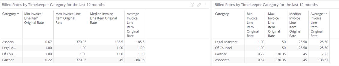
- Min Invoice Line Item Original Rate: Minimum value of the timekeeper rates
- Max Invoice Line Item Original Rate: Maximum value of the timekeeper rates
- Median Invoice Line Item Original Rate: Middle value of the list of timekeeper rates
- Average Invoice Line Item Original Rate: Mean Average value of the list of timekeeper rates (Sum of items divided by the number of items, there is a standard mean function that does the calculation)
Note: When you see from Today, The Last 12 months' data refers to the period from June 2022 to March 2023. Invoices created from a future date such as March 2023 will also appear in the widget, this is a limitation of Sisense.
Average Timekeeper Rate by Category for the last 5 Years
This Widget Average Timekeeper Rate by Category for the last 5 Years shows the timekeeper rate by category for a specific law firm compared to other specified law firm(s).The source data is invoice line items for task or expense, invoice type and invoice posting status with service dates within the last 5 years without the intervention of the timeline filter. The report will only include Standard invoices with a posting status of Posted. This can be visualized using Bar diagram as shown:
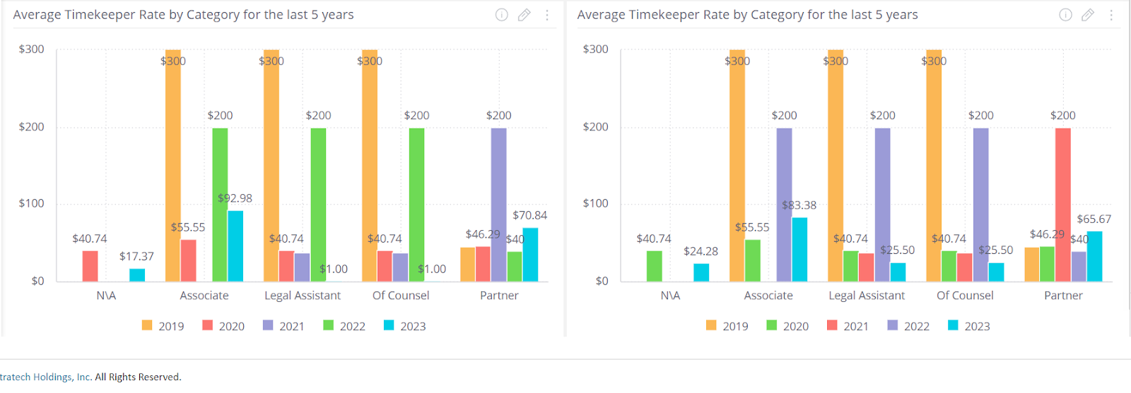
The currency information in the Average Timekeeper Rate by Category for the last 5 Years widget has been normalized into the system currency i.e., the values of invoices which were submitted in the currency different from system currency will be automatically converted to the system currency.
Technical Specifications
| Widget Name | Parameters | Obeys dashboard filters | Design |
|
Spend Percentage by Gender |
Pie Chart of the Percentage of spend by Gender |
Yes |
Pie type: classic |
|
Hours Billed Percentage by Gender |
Pie Chart of the Percentage of Hours billed by Gender |
Yes |
Pie type: classic |
|
Spend Percentage by Race |
Pie Chart of the Percentage of spend by Race |
Yes |
Pie type: classic |
|
Hours Billed Percentage by Race |
Pie Chart of the Percentage of Hours billed by Race |
Yes |
Pie type: classic |
|
Expenses by MitraCode |
Pie Chart of the Percentage of expenses by MitraCode |
Yes |
Pie type: classic |
|
Top 10 MitraCodes by Fees billed |
Pie Chart of the Percentage of top 10 MitraCodes by fees billed |
Yes |
Pie type: classic |
|
Top 10 MitraCodes by Hours billed |
Pie Chart of the Percentage of top 10 MitraCodes by hours billed |
Yes |
Pie type: classic |
|
Summary of Fees by Top 5 MitraCodes and Top 4 Positions |
Stacked bar chart that consists of top 5 MitraCodes as the bars and top 4 positions based on the fees billed for that specific MitraCode stacked on individual bars. |
Yes |
Bar diagram: classic |
|
Fee Adjustment Counts by MitraCode |
Pie Chart of the count of fee adjustment by MitraCode |
Yes |
Pie type: classic |
|
Expense Adjustment Counts by MitraCode |
Pie Chart of the count of expense adjustment by MitraCode |
Yes |
Pie type: classic |
|
Billed Rates by Timekeeper for the last 12 months |
Table that consists of Minimum, Maximum, Median and Average values billed for Timekeeper rates |
Yes |
NA |
|
Average Timekeeper Rate by Category for the last 5 Years |
Bar chart of the timekeeper rate by category |
Yes |
Bar diagram: classic |
Summary
As a quick summary, this dashboard addresses the following activities:
- How much spend is billed based on gender and race for a specific Law Firm compared to a specified law firm(s)?
- How much Percentage of Hours is billed based on gender and race for a specific Law Firm compared to a specified law firm(s)?
- How much fees are billed across each MitraCode by a specific Law Firm compared to a specified law firm(s)?
- How many Hours Billed across each MitraCode by a specific Law Firm compared to a specified law firm(s)?
- How much expenses are billed across each MitraCode by a specific Law Firm compared to a specified law firm(s)?
- How much is the average timekeeper rate across each MitraCode by a specific Law Firm compared to a specified law firm(s)?