
Understanding Naming Conventions/Field Types
Refer to “Using this Guide” on page 2 for more information on typography conventions used throughout the documentation to denote different items in the interface (for example, all button names are bolded).
|
Name |
Definition |
Example |
|---|---|---|
|
Page |
A page is the part of the Suite window that contains the fields for data entry. |
|
|
Dialog Box |
A dialog box is a secondary or popup window that may contain buttons and/or options through which users can carry out a particular command or task. |
|
|
Checkbox |
A box that allows an option to be turned on or off. Click inside the box to select (a checkmark appears) or clear. More than one checkbox can be selected. |
 |
|
Date Field |
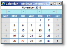
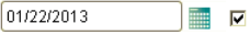
All date fields in Suite have a popup calendar that makes it easy to select a date. When you click the Calendar button, you will see a monthly calendar with the current system date marked in red. The right and left arrows advance or go back one month, respectively. The double right and left arrows advance or go back one year, respectively. To enter a date directly in the text box without using the calendar, enter the date as MM/DD/YYYY, where MM is the month, DD is the day, and YYYY is the four-digit year. To enter today’s date, simply type “t” and the current date will be shown. If a date is not known, simply type “u” and the date will be shown as “unknown”. |
 |
|
Date fields that are linked to the Calendar module have a checkmark next to the date field. Clicking this button will open the Calendar dialog box. From there, you can edit the existing appointment or task or create a new one. The System Administrator determines the information that will automatically populate the fields. |
 |
|
|
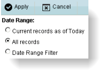
Date Range Prompt |
Some lists and grids can be filtered to show only records that fall with specified date parameters. Click the link and select the desired date range from the popup dialog box. See “To Change the Date Range of Records” on page 37 for more information. |
 |
|
Dropdown Arrow |
An arrow associated with a field, indicating a list that can be viewed by clicking the arrow. |
 |
|
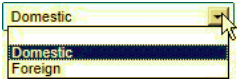
Dropdown List Field |
A field that has a dropdown arrow. Click the arrow to reveal a dropdown list of choices for that field. Clicking on the appropriate choice will highlight it and copy it into the field. Enter text into the field to incrementally search the values in the list. Some fields with dropdown lists will allow text to be entered (these are called “combo boxes”). If you click in the field (not on the arrow) and the dropdown list does not appear, text can be entered. |
 |
|
Exploding Memo Field |
Exploding memo fields are comment fields with an ellipse (...) button. Clicking the Comments dialog box. The Date Stamp button will add your user name and the current system date and time at the cursor’s position. |
 |
|
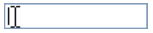
Freeform Text Field |
A field in which text can be typed. If the field already contains text, you can select that default text or delete it and type new text. |
 |
|
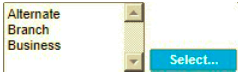
Multi-select |
Any type of box that allows you to select multiple values. |
 |
|
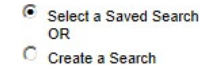
Option Button (also called radio button) |
A round box that is clicked to select an option. Option buttons are an “either or” selection—only one can be selected. |
 |
|
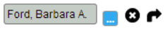
Select Field |
A field from which you can select a person, entity, or matter. Clicking the |
 |
|
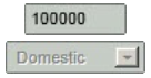
Required Field |
Required fields are fields that must have data in order for Suite to create or update a record. Not all tabs have required fields. Some fields are required by the database; others are specified by the System Administrator. Required fields are usually identified by a color shading in the data area. If you attempt to exit a tab with a blank required field, an error message will display. Click Cancel to exit without saving or enter data in the required fields. |
 |
|
Read-only Field |
Read-only fields are those fields for which data entry has been restricted for a user. Typically, read-only fields appear with a shaded background. For dropdown list fields, the background is white, but the dropdown arrow is not selectable. |
 |
|
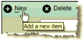
Hint |
Pointing the cursor over a button will popup a hint or tip for using the button. |
 |