
Display Controls
The display controls for Indexing Studio and Searching Client are shown on the right side of the General Properties tab.
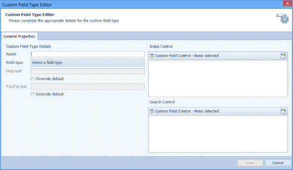
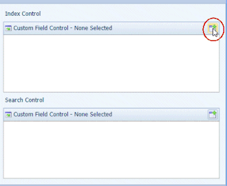
The Display Controls enable you to configure the display options for Indexing and for Searching. Select the Add button for the Index Control.
Note: Search Templates created automatically when a Data Definition is Published have the option Search parameter choices set to None (do not use search parameter choice). If you have configured Allowable values (either via a Custom Field Type or a Data Definition’s Index field) and have selected a Display Control, you should edit the automatically created Search Template and set the Search parameter choices to Use Linked Field’s allowed values. This will ensure the Search Template uses the configured Display Control to allow the user to select an Allowable Value for Searching
Select a Compatible Control.
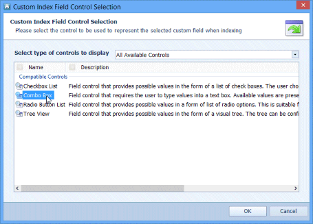
The standard default controls are:
Check Box
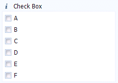
The Display Properties for the Check Box display control are described in Table 45.
Table 45. Terminology: CFT Editor – Check Box Display Properties
|
Term |
Meaning |
|---|---|
|
Back Colour |
Sets the background colour of the display. |
|
Border Colour |
Sets the border colour of the display. |
|
Horizontal Orientation |
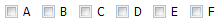
True – displays the check boxes horizontally:
False – the check boxes are displayed vertically, as in the example above this table. |
|
Maximum Number of Items |
Sets the maximum number of items that can be displayed. Default value: 500 |
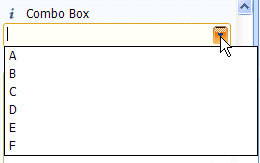
Combo Box
The Display Properties for the Combo Box display control are described in Table 46.
Table 46. Terminology: CFT Editor – Combo Box Display Properties
|
Term |
Meaning |
|---|---|
|
Allow Manual Field Entry |
True – The user can edit the value. |
|
Back Colour |
Sets the background colour of the display. |
|
Border Colour |
Sets the border colour of the display. |
|
Error Border Colour |
Sets the border colour of the display when an invalid value has been entered. |
|
Error Colour |
Sets the colour of the text when an invalid value has been entered. |
|
Fore Colours |
Sets the colour of the text when a valid value has been entered. |
|
Maximum Number of Items |
Sets the maximum number of items which can be displayed in the Combo Box. |
21.2.3. Radio Button
The Display Properties for the Radio Button display control are described in Table 47.
Table 47. Terminology: CFT Editor – Radio Button Display Properties
|
Term |
Meaning |
|---|---|
|
Back Colour |
Sets the background colour of the display. |
|
Border Colour |
Sets the border colour of the display. |
|
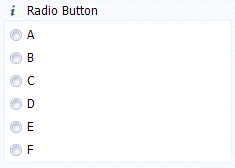
Horizontal Orientation |
True – displays the radio buttons horizontally:
False – the radio buttons are displayed vertically, as in the example above this table. |
|
Maximum Number of Items |
Sets the maximum number of items that can be displayed. Default value: 500 |
Tree View
The Display Properties for the Tree View display control are described in Table 48.
Table 48. Terminology: CFT Editor – Tree View Display Properties
|
Term |
Meaning |
|---|---|
|
Back Colour |
Sets the background colour of the display. |
|
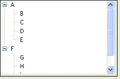
Expanded |
True – tree nodes are expanded (as shown in the example above this table). False – tree nodes are collapsed. |