Defining Pages for User Input
For example, your users may need to generate letters in which a paragraph explaining the status of a claim must be typed by the user, while the rest of the letter is automatically generated. In this case, you have to create an input page where the user types the explanation for the generated document.
Note: When nesting the tc:input or tc:inputForm tags within the tc:header tag, you must make sure that each tc:input tag in the content section corresponds to a tag in the header section.
The following list shows the different types of input tags you may use in the header section of the document template:
|
|
Requires the user to enter text in a single-entry field within one input page in the end-user interface of the Document Generator. For details, see Creating User Input Fields.
Requires the user to enter the appropriate information in multiple-entry fields within one input page in the end-user interface of the Document Generator. For details, see Displaying Multiple Entry Fields in One Input Page. |
Creating User Input Fields
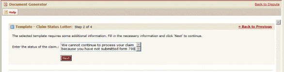
The tc:input tag creates a single entry field within one input page (see the single simple text field example image). Each entry field will appear on a separate page.
The following image provides a list of the attributes and possible attribute values that can be used with the tc:input tag within the header section of the document template.
tc:input attributes in Header Section
|
Tag attribute |
Attribute value |
Description |
|---|---|---|
|
|
"FieldName" |
Specify a name that uniquely identifies the field you are creating. Important: This attribute value must exactly match the select="" attribute value of the corresponding tc:input tag you entered in the content section. The name attribute must always be used when the tc:input tag is nested within the header section. |
|
|
"FieldLabel" |
Enter a label that will display instructions for the user within the input page. |
|
|
"FieldSize" |
Specify the maximum size, in characters, of the entry field within the input page. This is the length of the field but does not control the number of characters the user may enter. |
|
|
"MaxNumCharacters" |
Specify the maximum number of characters that the user can enter into the input field. Note: This attribute is not available when the input field is scrollable (when multi attribute is set to "yes"). |
|
|
"yes" |
Enter "yes" as the attribute value to allow users to enter information into a scrollable text field within the input page (see the single scrollable text field example image). This is useful when a large amount of text needs to be entered by the user. Note: By default, users will always enter information into a one-line text field (see the single simple text field example image). If you would like users to have only a text field, simply do not use the multi attribute, there is no need to enter "no" as the attribute value. |
|
|
"ColumnWidth" |
Specify the width of the columns of the scroll text field. The number you enter represents the number of columns. This attribute is used in conjunction with the multi attribute. |
|
|
"RowLength" |
Specify the length of rows in the scroll text field. The number you enter represents the number of rows. This attribute is used in conjunction with the multi attribute. |
Let's see how the tc:input tag and its attributes were used in the content and header sections in order to create the input page with a simple text field shown in the following image. Notice that the select attribute value in the content section exactly matches the name attribute value in the header section.
|
Header |
|

Next, you may check how the tc:input tag and its attributes were used in the content and header sections in order to create the input page with a scrollable text field shown in the following image.
|
Header
Content |
|
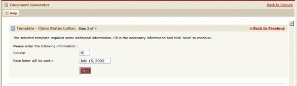
Displaying Multiple Entry Fields in One Input Page
The inputForm tag lets you display multiple entry fields within one input page (see the multi-entry field example image for example). This task is accomplished by nesting tc:input tags within a tc:inputForm tag. You can nest multiple tc:input tags as needed. Each tc:input tag can use any of the attributes described in the tc:input attributes in Header Section table.
tc:inputForm attributes in Header Section
|
Tag attribute |
Attribute value |
Description |
|---|---|---|
|
name |
"FormName" |
Specify a name that uniquely identifies the input page you are creating.
|
|
label |
"FormLabel" |
Enter a label that will display instructions for the user within the input page. |
Let's see how the tc:inputForm tag and its attributes were used in the content and header sections in order to create the input page shown in the single simple text field example image. Each tc:input tag is nested within the tc:inputForm tag. Notice that the select attribute value in the content section contains the name attribute value of both the tc:inputForm and tc:input tags in the header section, separated by a period (.).
Header
<tc:inputForm name="UserInput" label="Enter the following information">

    <tc:input name="UserInitials" label="Initials" size="3" maxChars="3" />

    <tc:input name="LetterDate" label="Date letter will be sent" size="15" />

</tc:inputForm>
Content
<tc:input select="UserInput.UserInitials" />

<tc:input select="UserInput.LetterDate" />