
Best Practices for Data Visualization
Fundamental Steps in the Design Process
- Determine the message and intended audience.
- Select the best medium to display the message.
- Design the display to show information simply, clearly, and accurately.
- Make the data (versus non-data) prominent and clear.
- Remove all components that aren’t necessary (both data and non-data components).
- Reduce the visual salience of the remaining non-data components in comparison to the data.
- Highlight the information that’s most important to your message.
Pivot Reports
To resolve duplicate entries, any contact related reports need to be created as pivot tables.
In general, it's a good practice not to create a report with aggregation for pivot type reports. TeamConnect Business Intelligence sums the identifiers in these reports.
Using Tables vs. Graphs
| Use Tables When | Use Graphs When |
| The display will be used to look up individual values | The message is contained in patterns, trends, and exceptions |
| The display will only be used to compare individual values rather than whole series of values | Entire series of values must be seen as a whole and/or compared |
| Precise values are required | |
| Values involve more than one unit of measure | |
| Values must be presented at various levels of aggregation (i.e. summary and detail) |
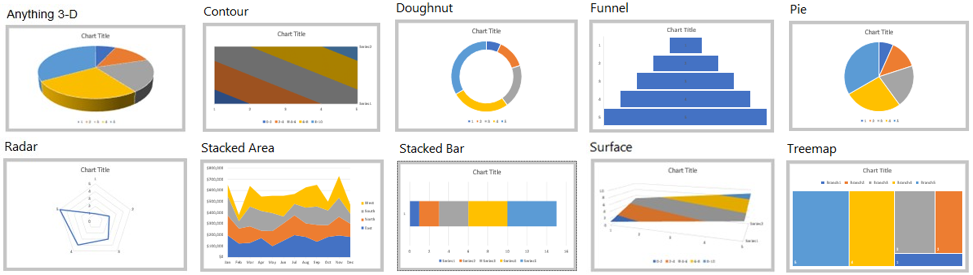
Graphs to Avoid
The graphs listed below demonstrate high visual impact but ineffective data communication.
Graphs and Data Relationships
| Points | Lines | Bars | |
 |
 |
 |
|
|
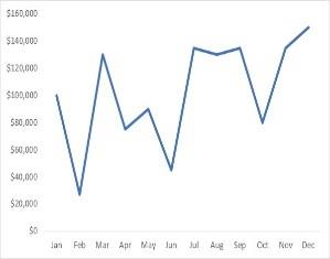
Time Series Values display how something changed through time (yearly, monthly, etc.) |
Yes (as a dot plot, when you don’t have a value for every interval of time) |
Yes (to feature overall trends and patterns and support their comparisons) |
Yes (vertical bars only, to feature individual values and to support their comparisons) |
|
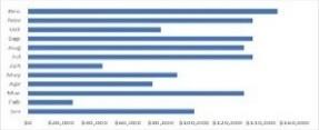
Ranking Values are ordered by size (descending or ascending) |
Yes (as a dot plot, especially when the quantitative scale does not begin at zero) |
No |
Yes |
|
Part-to-Whole Values represent parts (proportions) of a whole (for example, regional portions of total sales) |
No |
Yes (to display how parts of a whole have changed through time) |
Yes |
|
Deviation The difference between two sets of values (for example, the variance between actual and budgeted expenses) |
Yes (as a dot plot, especially when the quantitative scale does not begin at zero) |
Yes (when also featuring a time series) |
Yes |
|
Distribution Counts of values per interval from lowest to highest (for example, counts of people by age intervals of 10 years each) |
Yes (as a strip plot to feature individual values) |
Yes (as a frequency polygon, to feature the overall shape of the distribution) |
Yes |
|
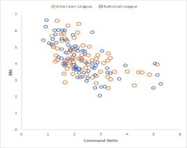
Correlation Comparison of two paired sets of values (for example, the heights and weights of several people) to determine if there is a relationship between them |
Yes (as a scatter plot) |
No |
Yes (as a table lens, especially when your audience is not familiar with scatter plots) |
|
Geospatial Values are displayed on a map to show their location |
Yes (as bubbles of various sizes on a map) |
Yes (to display routes on a map) |
No |
|
Nominal Comparison A simple comparison of values for a set of unordered items (for example, products or regions) |
Yes (as a dot plot, especially when the quantitative scale does not begin at zero) |
No |
Yes |