
System Settings
System Settings allows the System Administrator to change system wide settings. These pages may vary at your installation due to licence key settings.
This information is normally available to, and should only be changed by, the System Administrator.
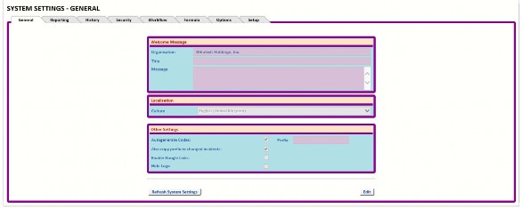
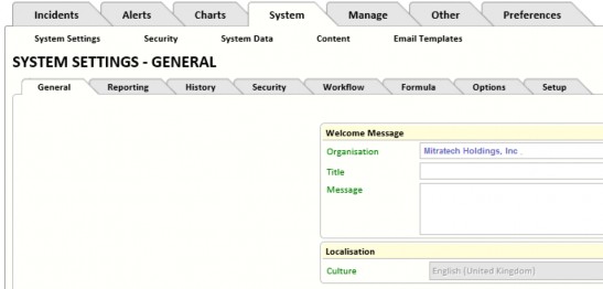
General Tab
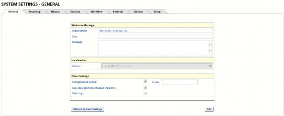
Welcome Message
If required, enter your company name in Organisation.
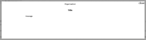
Title and Message may be used to display a message-of-the-day or an important message from the System Administrator. If both are left blank there will be no pop-up box at login.
Localisation
Selecting the Culture determines the currency symbol (for example, £) and numeric value separators. It is not involved in system wide translation.
Other Settings
Select Autogenerate Codes to configure the system to automatically generate Incident IDs.
If required, enter a Prefix in the box. For example, entering In in the Prefix box causes new Incidents to be numbered (for example) In100, In101.
Select Also copy prefix to changed incidents to cause the configured Prefix to be added to the Incident ID when an Incident (which does not have the Prefix in its Incident ID) is changed. A suggested use of this feature is to change the Prefix to be the last 2 digits of the year and separate with a colon (for example 15:). It will then be easy to see which Incidents have been updated this year.
Note: The Prefix is ignored when searching for an Incident by its ID.

Google Links is provided for access to the Google Toolbar which includes a spellchecker.
When Hide Logo is selected, the logo at the top of the page is hidden on many of the pages allowing you more space on the working forms.
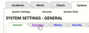
Reporting Tab
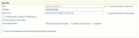
Reporting
Specify headers and footers to be used on reports (these fields are included on most, but not all, reports).
- Title – Provide the text to appear in the top left of the report. (Title is not used when Use Division Name in report title is selected – see below.)
- Top Right – Provide the text to appear in the top right of the report.
- Bottom Left – Provide the text to appear in the bottom left of the report. (Bottom Left is not used when Use Division Name in report footer is selected – see below.)
- Use Division Name in report title – Select if you want reports to use the relevant Division Name instead of Title.
- Use Division Name in report footer – Select if you want reports to use the relevant Division Name instead of Bottom Left.
- Include Incident List Report in HTML Format: – When selected and when the Incident List Report is selected, an extra print button is provided: Print Using HTML. This button displays an HTML version of the Incident List Report.
- Show reports in new window – Select if you want reports to be displayed in a new browser window. When cleared, the current browser window is used. Use the back button to return to Incident Manager.
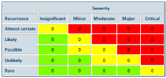
- Show Incident Matrix – Whenever the selected report includes an Incident Matrix:
- Recurrence on left of matrix – Recurrence is shown on the left side of the Incident Matrix (as shown in the examples below).
- Severity on left of matrix – Severity is shown on the left side of the Incident Matrix.
- Inverted – When selected, for the Recurrence, Rare appears at the top and Almost certain is at the bottom.
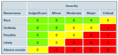
When cleared, Almost certain appears at the top and Rare appears at the bottom.
- Ask to include Department objectives in reports grouped by Department – Some reports have the option to Group By (for example, the Action Status Report and the Incident List Report). When Ask to include Department objectives in reports grouped by Department is selected and when Group By is set to Department, an extra option appears in the Report Wizard which allows you to select Append objectives to group name. When Append objectives to group name is selected, any item in the selected Report which is assigned to a Department which has an Objective configured, shows the department’s Objective appended to the Department name on the Report. See “Departments” on page 70 for information on adding an Objective to a Department.
History Tab
Many Incident and Action events are automatically logged to the Incident History page or the Action History page, as appropriate. However, other history items are optional and can be selected here.
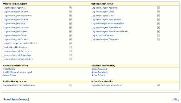
Optional History
When the Optional Incident History option Log any changes of Owner is selected, manual changes of an Incident owner are logged to the history page. The same applies to Log any change of Contact and Log any change of Action Owner.
Automatic Incident And Action History
The items listed in this section are always logged and cannot be disabled.
History Location
Two settings are provided to allow you to decide where the Action history is logged.
-
Log action history to incident form
-
Log action history to action form
You can decide to:
- Clear both options, and not log the Action history.
- Select Log action history to incident form to log the Action history to the Incident page. To view an Action’s History on the Incident page, perform an Incident Search, View an Incident and select the History tab. All Action History since this option was selected is listed on this page. If this option is cleared, no more Action History is logged here.
- Select Log action history to action form to log the Action history to the Action page. To view an Action’s History on the Action page, perform an Incident Search, then View an Incident, select the Action tab and click the History link. All Action History since this option was selected is listed on this page. If this option is cleared, no more Action History is logged here.
- Select both options to log the Action history to both the Action and the Incident pages.
Security Tab
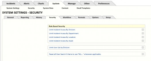
The Security tab allows the System Administrator to specify the level of business unit security on the system. Most customers limit access to Division only.
- Select Limit Incident Access by Division and then, in RBS, assign people to the relevant Division.
Note: If you want a User to have access to more than one Division you will need to assign them to each Division.
- Select Limit Incident Access by Department and then, in RBS, assign people to the relevant Department.
Note: If you want a User to have access to more than one department you will need to assign them to each Department.
- Limit Incident Access by Location is rarely used. In RBS, assign people to the relevant Location.
Note: If you want a User to have access to more than one location you will need to assign them to each Location.
-
Limit Incident Access by Asset is rarely used. In RBS, assign people to the relevant Asset.
Note: If you want a User to have access to more than one asset you will need to assign them to each Asset.
If you want to have access to all Divisions or Departments or Locations or Assets, you can assign yourself to All Divisions or All Departments or All Locations or All Assets in RBS.
You can allow some Users to have read-only access to a common set of Incidents by Division, such as a pseudo-division named Across all Division. To do this, edit that Division record via the More link and select Allow this division to be viewed by all users. You can then assign that division to the Users who need access to all the Incidents in that Division.
To reduce the size of user picklists, you can assign a Division to each User and then enable Limit User List by Division (see “Example Of Row Level Security” on page 49). When entering Incidents, the list will then be filtered to show only Users in the selected Division.
- Reset all Search Criteria to use “My…” whenever applicable – When one or more of the Limit Incident Access By options have been selected and a User has been assigned to a Division, Department, Location and/or Asset, as appropriate, the Incident Search page labels the fields My Divisions, My Departments, My Locations and/or My Assets, as appropriate.
Note: Reset all Search Criteria to use “My…” whenever applicable is used when at least one of the following options is selected: Limit Incident Access By Division, Limit Incident Access By Department, Limit Incident Access By Location and/or Limit Incident Access By Asset.
Workflow Tab
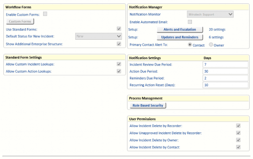
Workflow Forms
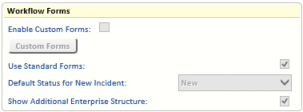
You may select from various form types:
-
Custom Forms (for any special requirements)
-
Standard Forms (most commonly used) At least one form type must be selected.
Note: When you want to use Custom Forms only, you must associate every Incident Type with a Custom Form. If there are any Incident Types which are not associated with a Custom Form, when you try to save the configuration (with Enable Custom Forms selected and Use Standard Forms cleared), you will see the following message:
There are existing incidents without an associated custom form. To disable tabbed forms, each existing incident must have an associated custom form. Select Incident Types on the Manage tab and assign a custom form to each Incident Type.
See “Using A Custom Form” on page 18 for information on assigning a Custom Form to an Incident Type.
The Custom Forms currently in use are listed under the Custom Forms button.
Activation of Custom Forms requires activation in the Incident Manager Licence key and must be activated here before you may access the Custom Forms button.
The Default Status for New Incident will normally be Input, but you may change the default status to Open. When the Default Status is set to Input, Incidents are validated before being set to Open. When the Default Status is set to Open, new Incidents do not go through a validation process.
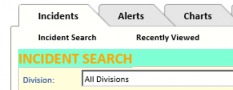
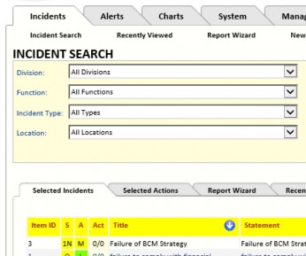
When Show Additional Enterprise Structure is cleared, the following search fields are available on the Incident Search form: Division, Department, Asset, Incident Type, Event Type, Status, Location, Categories and Owner.
When Show Additional Enterprise Structure is selected, the search fields Project, Function and
Class are included in addition to the search fields listed above.
Standard Form Settings
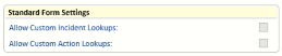
Allow Custom Incident Lookups – The Incident Lookup fields are available when creating and viewing Incidents using the standard form.
Allow Custom Action Lookups – The Lookup tab is available when creating and viewing Actions associated with Incidents created using the standard form.
See “Manage Lookups” on page 79 for more information on Incident and Action Lookups.
Notification Manager
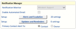
The activation of Automated Notifications requires the installation of a Windows Service, activation in the Incident Manager Licence key, and it also needs to be activated here before it will operate.
Alerts and escalations may be set up for reviews and Actions that are due and overdue.
In edit mode, select a Notification Monitor from the drop-down list. The Notification Monitor can be sent Alerts and Escalations. See “Alerts And Escalations” on page 26 for details.
Select Enable Automated Email to enable the Notifications. When this option is cleared, no email notifications are sent and the Notification settings configured via the Alerts and Escalations button are ignored.
Click Alerts and Escalations to configure who will received emails and alerts when items are overdue or have been changed. The number of currently selected tick-boxes on the Alert and Escalation page is shown to the right of the Alerts and Escalation button.
Alerts are sent to the Primary Contact (when configured on the Alert and Escalation page). Here, select either the Incident Contact or Owner to determine the Primary Contact. The Incident’s Owner and Contact are both configured on the Incident’s Ownership and Dates tab.
Alerts And Escalations
Click Edit on the line you want to make changes to.
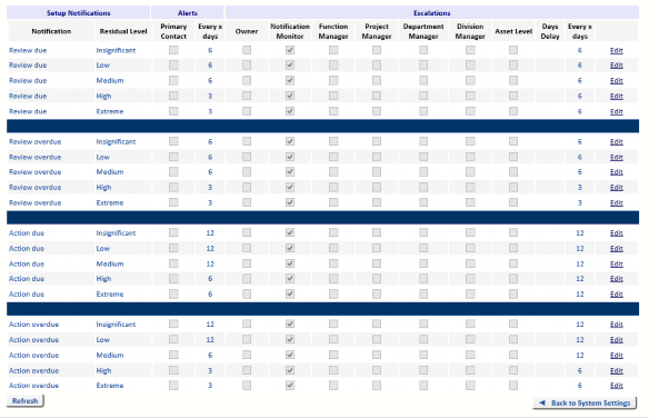
There are four types of Notifications:
- Review due – the Date Next Review is approaching. The number of days is set in the
Incident Review Due Period. See “Notification Settings” on page 28 for more information.
- Review overdue – the Date Next Review has passed and the Incident has not yet been reviewed.
- Action due – the Action Due Date is approaching. The number of days is set by the Action Due Period. See “Notification Settings” on page 28 for more information.
- Action overdue – the Action Due Date has passed and the Action has not yet been completed.
For each type of Notification, the list of Incident Ratings is provided. It is therefore possible to have different notifications and alerts configured for each of the incident ratings for each of the types of Notification listed above.
Alerts
Alerts are displayed on the user’s Alerts tab.
For each Residual Level in each Notification type (Review due, Review overdue, Action due and Action overdue), select whether the Primary Contact will receive an alert (the Primary Contact is configured on the Workflow page on the System Settings tab. See “Notification Manager” on page 25 for more information.
Set the frequency of Alerts. For example, set 6 to ensure the Primary Contact receives an Alert every 6 days until the Incident Review is completed or the Action is completed. This number is ignored if the Primary Contact option is cleared.
Escalations
-
Owner – the Owner of the Incident or Action (as appropriate) is sent an email.
-
Notification Monitor – the Notification Monitor is sent an email. The Notification Monitor is set on the Workflow tab, on the System Settings tab. See “Notification Manager” on page 25 for more information.
-
Function Manager – The Function Manager for the Function configured for the Incident is sent an email. If there is no Function configured for the Incident, or if there is no Function Manager configured for the Incident’s Function, then no email is sent.
-
Project Manager – The Project Manager for the Project configured for the Incident is sent an email. If there is no Project configured for the Incident, or if there is no Project Manager configured for the Incident’s Project, then no email is sent.
-
Department Manager – The Department Manager for the Department configured for the Incident is sent an email. If there is no Department configured for the Incident, or if there is no Department Manager configured for the Incident’s Department, then no email is sent.
-
Division Manager – The Division Manager for the Division configured for the Incident is sent an email. If there is no Division configured for the Incident, or if there is no Division Manager configured for the Incident’s Division, then no email is sent.
-
Asset Level – The manager of the Asset configured for the Incident is sent an email. If there is no Asset configured for the Incident, or if there is no Manager configured for the Incident’s Asset, then no email is sent.
-
Days Delay – Enter the number of days (after the escalation occurred) before the first email is sent. For example, if you enter 3, then the first email is sent 3 days after an Incident’s Review or Action was due or an Incident review or Action became overdue.
-
Every x days – Enter the number of days between subsequent emails. For example, if you enter 2, then, after the first email, more emails are sent every two days.
Note: When Alerts or Escalations are set for a Review due, the alerts and escalations stop when the Review is completed or becomes overdue.
When Alerts or Escalations are set for a Review overdue, the alerts and escalations stop when the Review is completed.
When Alerts or Escalations are set for an Action due, the alerts and escalations stop when the Action is completed or becomes overdue.
When Alerts or Escalations are set for an Action overdue, the alerts and escalations stop when the Action is completed.
Updates And Reminders
This screen is used to configure if emails should be sent to the Notification Manager and other users when specific events have occurred.
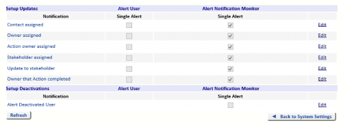
Setup Updates
The first section is used to set email notifications about updates to Incidents. Emails can be sent to a user assigned to the Incident as the Contact, Owner, Action Owner, etc. and/or to the Notification Monitor. (The Notification Monitor is set on the Workflow tab, on the System Settings tab. See “Notification Manager” on page 25 for more information.)
- Contact assigned – Send an email to the Contact assigned to an Incident and/or to the Notification Monitor.
- Owner assigned – Send an email to the Owner assigned to an Incident and/or to the Notification Monitor.
- Action owner assigned – Send an email to the Owner assigned to an Incident’s Action and/or to the Notification Monitor.
- Stakeholder assigned – Send an email to the Stakeholder assigned to an Incident and/or to the Notification Monitor.
- Update to stakeholder – Send an email to the updated Stakeholder assigned to an Incident and/or to the Notification Monitor.
- Owner that Action completed – Send an email to the Action Owner and/or the Notification Monitor when an Action is completed.
Setup Deactivations
There is one deactivation notification:
- Alert Deactivated User – Send a single email to the Notification Monitor when a user account is deactivated.
Notification Settings
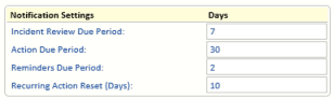
Specify how many days before an Incident review, an Action is due, and a recurring Action is due, the responsible Users are sent a reminder.
- Incident Review Due Period – Set the number of days before an Incident Review is due that a reminder is sent (if configured).
- Action Due Period – Set the number of days before an Action is due that a reminder is sent (if configured).
- Reminders Due Period – Set the number of days before a Reminder is due that a reminder is sent (if configured).
- Recurring Action Reset (Days) – Set the number of days before a recurring Action’s Due Date that its Completed Date is cleared. This must be a negative number. For example, consider a recurring Action with the Frequency set to Annually. If this Annually recurring Action was last Completed on 1st January 2014 and Recurring Action Reset (Days) is set to -10, the Action’s Completed Date of 1/1/2014 will be cleared 10 days before its Due Date of 1st January 2015 (as the default value for a Year is 365 days – see Manage, Reference Data, Action Frequency for information on changing this). The date of reset will be 22nd December 2014. As the Completed Date is now blank, it is eligible for a reminder to be sent. Once the Mitigation Action Due Period for an action is reached, an email will be sent.
Process Management
Click Role Base Security to navigate to the Role Permissions tab on the Security page on the
System tab. See “System Security” on page 43 for details.
User Permissions
Select what the Incident Owner, Recorder and Contact can delete.
If RBS is active and the user has the RBS Administration permission Super User Edit or Delete any Risk/Incident selected, the user will be able to delete all Incidents regardless of the settings on the Workflow tab. If the RBS permission Super User Edit or Delete any Risk/Incident is cleared, the Workflow tab settings are considered. (This RBS setting can be overridden by the administration settings in the web.config file.)
TABLE 1. User Permissions
|
User Permission |
Setting |
Permissions |
|---|---|---|
|
Allow Incident Delete By Recorder |
Selected |
The user set in the Recorded By field in the Incident can delete the Incident. |
|
Cleared |
The user set in the Recorded By field in the Incident cannot delete the Incident (unless they have the RBS permission to delete all Incidents). |
|
|
Allow Unapproved Incident Delete By Recorder |
Selected |
The user set in the Recorded By field in the Incident can delete the Incident if the Incident is unapproved. An Incident is unapproved if the Date Approved and Approved By fields have not been completed. |
|
Cleared |
The user set in the Recorded By field in the Incident cannot delete the Incident (unless they have the RBS permission to delete all Incidents). |
TABLE 1. User Permissions
|
User Permission |
Setting |
Permissions |
|---|---|---|
|
Allow Incident Delete by Owner |
Selected |
The user set in the Owner field in the Incident can delete the Incident. |
|
Cleared |
The user set in the Owner field in the Incident cannot delete the Incident (unless they have the RBS permission to delete all Incidents). |
|
|
Allow Incident Delete by Contact |
Selected |
The user set in the Contact field in the Incident can delete the Incident. |
|
Cleared |
The user set in the Contact field in the Incident cannot delete the Incident (unless they have the RBS permission to delete all Incidents). |
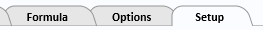
Formula Tab
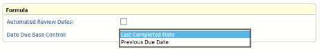
- Automated Review Dates – When the Review Frequency is changed on the Incident’s Ownership and Dates tab, the Date Next Review is updated automatically. When cleared, the Date Next Review must be entered manually.
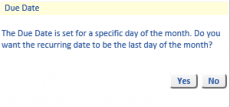
- Date Due Base Control - Determines whether the Action Frequency is calculated from the Last Completed Date or the Previous Due Date. Click the Edit button to enable the frequency Date Due Base Control selections. The Action Frequency can be set to a specific date in a month or the last day of the month, irrespective of the number of days in the month, See “Action Frequency” on page 68 for more details. When the Due Date or the Last Completed Date (for the Risk Action and Incident Action) is set to 28th February, 29th or 30th of the month the following message will be displayed:
Options Tab
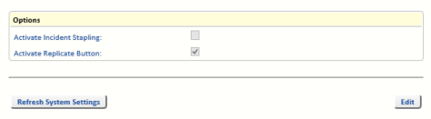
Options
These options require activation in the Incident Manager Licence key even though they may not be a billable option.
- Activate Incident Stapling – Stapled Incidents appear on the Incidents menu, and a Staple button appears at the bottom of any Incident form. See Staple Button in the Incidents chapter of the OpRiskControl Incident Manager Users’ Guide.
- Activate Replicate Button – The Replicate buttons enable Users to create a new Incident based on an existing Incident. See Replicate Button and Replicate With Actions Button in the Incidents chapter of the OpRiskControl Incident Manager Users’ Guide.
Setup Tab
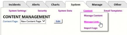
Home page – Select the Home page from the drop-down list. A new Home page can be created by selecting the System tab, clicking Content and selecting Manage Content from the menu. See “Manage Content” on page 61 for more information.
Set Incident IDs to start numbering from – Sets the start number for new Incidents. This value must be set higher than the highest automatically numbered Incident.
Set Action IDs to start numbering from – Sets the start number for new Actions. This value must be set higher than the highest automatically numbered Action.
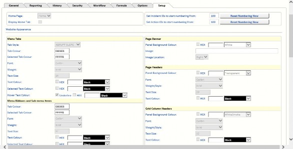
Each section on this page is described below.
Menu Tabs
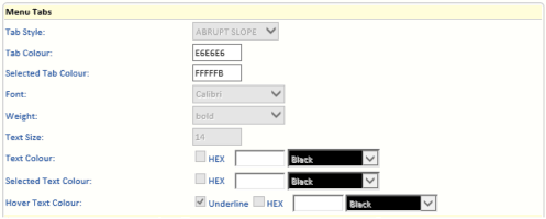
Tab Style – Select one of the following styles for the tabs:
ABRUPT SLOPE
SMOOTH SLOPE
Tab Colour – Cannot be changed.
Selected Tab Colour – Cannot be changed.
Font – Select the font you want to use for the text on the tabs.
Weight – Select the weight of the selected font you want to use for the text on the tabs.
Text Size – Select size (in points) of the selected font you want to use for the text on the tabs.
Text Colour – Select the colour of the selected font you want to use for the text on the unselected tabs. Purple is selected in the example below.
Selected Text Colour – Select the colour of the font you want to use for the text on the selected tab. Cyan is selected in the example below.
Hover Text Colour – Select Underline if you want the text to be underlined when the mouse hovers over it. Select the colour of the selected font you want to use for the text on the tab the mouse is hovering over. Orange is selected in the example below.

Menu Ribbons And Sub-Menu Items
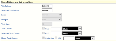
Tab Colour – Cannot be changed.
Selected Tab Colour – Cannot be changed.
Font – Select the font you want to use for the text on the menu items.
Weight – Select the weight of the font you want to use for the text on the menu items.
Text Size – Select the size of the font you want to use for the text on the menu items.
Text Colour – Select the colour of the font you want to use for the text on the unselected tabs. Purple is selected in the example below.
Selected Text Colour – Select the colour of the font you want to use for the selected text.
Hover Text Colour – Select Underline if you want the text to be underlined when the mouse hovers over it. Select the colour of the font you want to use for the text on the menu item the mouse is hovering over. Fuchsia is selected in the example below.
Panel Headers And Borders
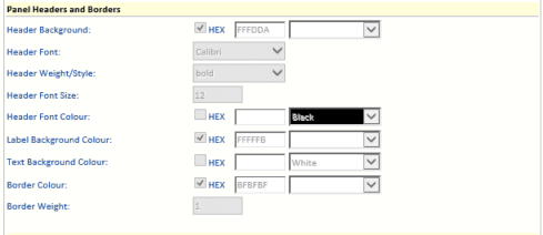
Header Background – Select the colour of the background of the panel headers. Bisque is selected in this example below.
Header Font – Select the font you want to use for the text on the panel headers.
Header Weight/Style – Select the weight and style of the font used on the panel headers.
Header Font Size – Select the size of the font used for the panel headers.
Header Font Colour – Select the colour of the text used in the panel headers. Brown is selected in the example below.
Label Background Colour – Select the background colour to be used with labels. Powder Blue is selected in the example below.
Text Background Colour – Select the colour you want used for the background of text boxes used in panels. Thistle (pink) is selected in the example below.
Border Colour – Select the colour you want used for the panel borders. Dark Magenta is selected in the example below.
Border Weight – Enter the point weight of the panel borders. The weight has been set to 5 in the example below.
Panel Tabs
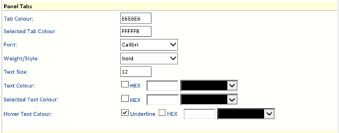
Tab Colour – Cannot be changed.
Selected Tab Colour – Cannot be changed.
Font – Select the font you want used on the Panel tabs.
Weight/Style – Select the weight and style of the font you want used on the panel tabs.
Text Size – Select the font size you want used on the Panel tabs.
Text Colour – Select the text colour you want used on unselected Panel tabs. Blue is selected in the example below.
Selected Text Colour – Select the text colour you want used on the selected Panel tab. Dark Green is selected in the example below.
Hover Text Colour – Select the text colour you want used when the mouse hovers over a Panel tab. Dark Orchid is selected in the example below.
Panel Content
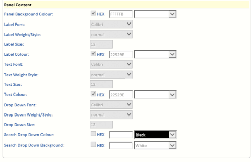
Panel Background Colour – Select the colour you want used for the panel background. Yellow is selected in the example below.
Label Font – Select the font to be used for the field labels in the panel. Label Weight/Style – Select the weight and style of the field label font. Label Size – Select the size of the field label font.
Label Colour –Select the colour of the field label text. Green is selected in the example below.
Text Font – Select the font to be used for the text which has been entered in the text boxes.
Text Weight/Style – Select the weight and style of the font to be used for the text which has been entered in the text boxes.
Text Size – Select the size of the font to be used for the text which has been entered in the text boxes.
Text Colour – Select the font colour to be used for the text which has been entered in the text boxes. Dark Blue is selected in the example below.
Drop Down Font – Select the font to be used in the drop-down menus.
Drop Down Weight/Style – Select the weight and style of the font to be used in the drop-down menus.
Drop Down Size – Select the size of the font to be used in the drop-down menus.
Search Drop Down Colour – Select the colour of the font to be used in the drop-down menus. White is selected in the example below.
Search Drop Down Background – Select the background colour to be used in the drop-down menus. Orange is selected in the example below.
Page Banner
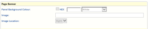
Panel Background Colour – Select the colour you want to appear at the top of the screen – where the company logo is shown.
Image – Select the image you want to appear on the right side of the banner.
Image Location – Cannot be changed from Right.
Page Headers
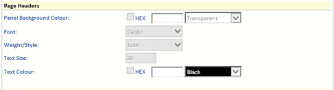
Panel Background Colour – Select the colour you want to use for the page header banner background. Aquamarine is selected in the example below.
Font – Select the font you want to use for the text in the page header banner.
Weight/Style – Select the weight and style of the font you want to use for the text in the page header banner.
Text Size – Select the font size you want to use for the text in the page header banner.
Text Colour – Select the colour you want to use for the text in the page header banner. Orange is selected in the example below
Grid Column Headers
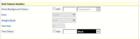
Panel Background Colour – Select the colour to be used for the background of the grid header text. Yellow is selected in the example below.
Font – Select the font to be used for the grid header text.
Weight/Style – Select the weight and style of the font to be used for the grid header text.
Text Size – Select the font size to be used for the grid header text.
Text Colour – Select the font colour to be used for the grid header text. Brown is selected in the example below.
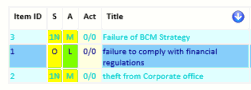
Grid Items
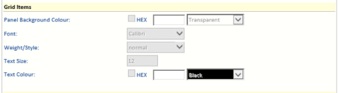
Panel Background Colour – Select the background colour to be used for the odd number rows in a grid display. Light Cyan is selected in the example below.
Font – Select the font to be used for the text in the odd number rows in a grid display.
Weight/Style – Select the weight and style of the font to be used for the text in the odd number rows in a grid display.
Text Size – Select the font size to be used for the text in the odd number rows in a grid display.
Text Colour – Select the font colour to be used for the text in the odd number rows in a grid display. Dark Turquoise is selected in the example below.
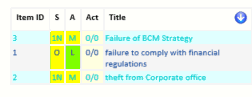
Alternate Grid Items
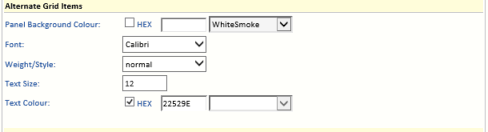
Panel Background Colour – Select the background colour to be used for the even number rows in a grid display. Blue is selected in the example below.
Font – Select the font to be used for the text in the even number rows in a grid display.
Weight/Style – Select the weight and style of the font to be used for the text in the even number rows in a grid display.
Text Size – Select the font size to be used for the text in the even number rows in a grid display.
Text Colour – Select the font colour to be used for the text in the even number rows in a grid display. Dark Blue is selected in the example below.
Footer
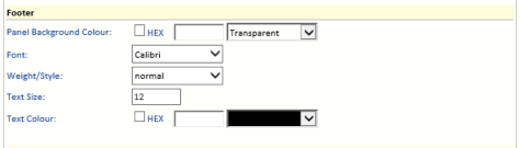
Panel Background Colour – Select the footer background colour. Light green is selected in the example below.
Font – Select the font to be used for the text in the footer.
Weight/Style – Select the weight and style of the font to be used for the text in the footer.
Text Size – Select the font size to be used for the text in the footer.
Text Colour – Select the font colour to be used for the text in the footer. Dark green is used in the example below.
Buttons
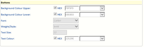
Background Colour Upper – Select the colour to be used for the top of the buttons. PaleGoldenrod is used in the example below.
Background Colour Lower – Select the colour to be used for the bottom of the buttons. Goldenrod is used in the example below.
Font – Select the font to be used for the text on the buttons.
Weight/Style – Select the weight and style of the font to be used for the text on the buttons.
Text Size – Select the size of the font to be used for the text on the buttons.
Text Colour – Select the colour to be used for the text on the buttons. The default blue is used in the example below.
Refresh System Settings
Click Refresh System Settings to reload all the System Settings.
Save Website Appearance
Click Save website appearance to save the current settings.
Restore Saved Website Appearance
Click Restore saved website appearance to restore the last saved settings.